
Introduction to Perspective Combination Charts
Perspective combination chart is a data lake visualization technology, which arranges and combines charts of the same type according to certain rules to form a large chart, and each small chart presents a part of the data. Perspective combination charts are often used to group and display large amounts of data in order to better observe and compare the relationship between different data. The advantage of the perspective combination chart is that it can present multiple data Dimensions at the same time, so that users can understand the relationship between the data more comprehensively. In addition, the perspective combination chart can also make it easier for users to compare the differences between different data by adjusting the arrangement and size of the subcharts.
Application Scenario
There are many application scenarios for perspective composite graphs in data lake visualization. Here are some examples of them:
- Visualization of big data collections: Perspective combination diagrams can be used to visualize big data collections. By arranging and combining data according to certain rules, data groups are displayed, so that users can better understand the relationship between data.
- Visualization of multidimensional data: Perspective combination charts can be used to visualize multidimensional data. By grouping data according to different attributes and presenting each grouped data in a certain form, users can observe data in multiple Dimensions at the same time.
- Comparison and analysis of data: Perspective combination charts can be used to compare and analyze data. By grouping data according to different attributes, and presenting the data of each grouping in a certain form, users can more easily compare and analyze the differences and relationships between different data.
- Data Exploration and Discovery: Perspective composite diagrams can be used to explore and discover patterns and trends in data. By grouping data according to different attributes and presenting each grouped data in a certain form, users can gain a more comprehensive understanding of the relationship between data, thereby discovering patterns and trends in data.
- Data reporting and presentation: Perspective composite diagrams can be used to present data reports. Data reports can be made easier to understand and present by grouping data according to different attributes and presenting each grouped data in a certain form.
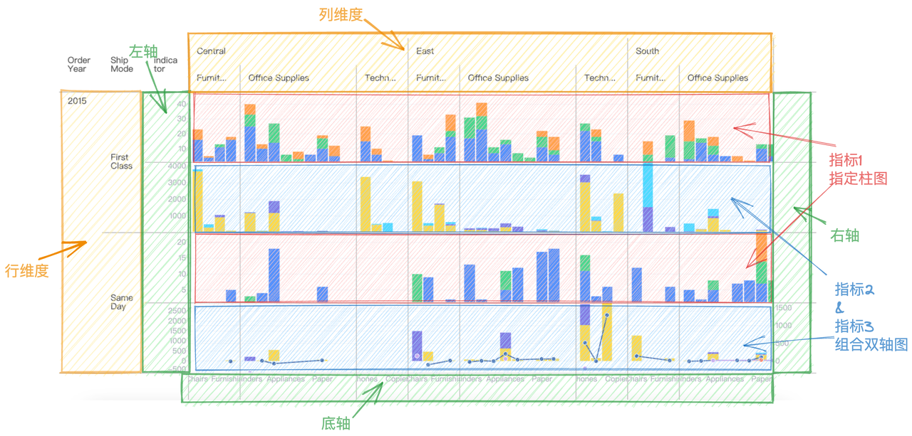
The structure of the perspective combination chart
The structure can be compared to pivot table. Compared with the pivot table, in addition to the column header, row header, corner header, and body, the perspective combination chart can also be configured with axis components in the four directions. Corresponds to the upper axis, next week, left axis, and right axis, and can also be configured separately Legend component.
The specific relevant configurations are as follows:
{
    rows: [
       {
          dimensionKey: 'Order Year',
          title: 'Order Year',
          headerStyle: {
            textBaseline:'top',
            textStick: true
          }
        },
        'Ship Mode'
    ],
    columns: [
        {
          dimensionKey: 'Region',
          title: '',
          headerStyle: {
            textStick: true
          }
        },
        'Category'
    ],
    indicators: [
      {
        indicatorKey: 'Quantity',
        title: 'Quantity',
        cellType:'chart',
        chartModule:'vchart',
        chartSpec:{} //对应vchart的spec,具体可参考vchart官网
      },
      {
        indicatorKey: 'Sales',
        title: 'Sales & Profit',
        cellType:'chart',
        chartModule:'vchart',
        chartSpec:{} //对应vchart的spec,具体可参考vchart官网
      }
    ],
    axes: [
      {
        orient: 'bottom'
      },
      {
        orient: 'left',
        title: {
          visible: true
        }
      },
      {
        orient: 'right',
        visible: true,
        grid: {
          visible: false
        }
      }
    ],
    legends: {
      data: [
        {
          label: '公司-数量',
          shape: {
            fill: '#2E62F1',
            symbolType: 'circle'
          }
        },
        {
          label: '小型企业-数量',
          shape: {
            fill: '#4DC36A',
            symbolType: 'square'
          }
        },
        ...
      ],
      orient: 'bottom',
      position: 'start',
      maxRow: 1,
      padding: [50, 0, 0, 0]
    },
    records:[
      {
        "Segment-Indicator": "Consumer-Quantity",
        "Region": "Central",
        "Category": "Furniture",
        "Quantity": "16",
        "Sub-Category": "Chairs",
        "Order Year": "2015",
        "Segment": "Consumer",
        "Ship Mode": "First Class"
      },
      {
        "Segment-Indicator": "Consumer-Quantity",
        "Region": "Central",
        "Category": "Furniture",
        "Quantity": "4",
        "Sub-Category": "Tables",
        "Order Year": "2015",
        "Segment": "Consumer",
        "Ship Mode": "First Class"
      },
      {
        "Segment-Indicator": "Corporate-Quantity",
        "Region": "Central",
        "Category": "Furniture",
        "Quantity": "2",
        "Sub-Category": "Bookcases",
        "Order Year": "2015",
        "Segment": "Corporate",
        "Ship Mode": "First Class"
      },
      ...
   ]
}
Corresponding to the schematic structure of the perspective combination diagram above:
-
rows configures the Dimension'Order Year 'and'Ship Mode' corresponding to the row header;
-
columns configures the Dimension'Region 'and'Category' corresponding to the list header;
-
indicators configures the indicator data to be analyzed:
Quantity,Sales,Profit;Quantitycorresponds to indicator 1 in the figure above, using a bar chart to show the trend;SalesandProfitcorrespond to indicators 2 and 3 in the above figure, and the data of the two indicators are displayed using a combined dual-axis chart.- You need to set
cellType:'chart', chartModule:'vchart'in the specific configuration ofindicatorto indicate that you want to configure the chart rendering type and specify that the registered chart library name isvchart. - For specific chartSpec configuration, please refer to VChart official website
-
indicatorAsCol configures the indicator at the row or column header. Note that:
- If true, that is, the indicator is in the column header, the corresponding chart display direction is horizontal;
- If it is false, that is, the indicator is at the head of the row, the display direction of the corresponding chart is vertical;
-
legends configuration legend style;

-
axes configures the global style of the axis. If axes have been configured in chartSpec in the Metirc configuration, the configuration in chartSpec will be used first.
-
chartDimensionLinkage The feature of interactive functions based on the same dimension value for multiple charts. It is an advanced capability of the perspective chart. Enabling it may affect performance. For specific configuration, please refer to Advanced Capabilities of Perspective Chart.
Chart Module Register
The chart library component needs to be injected before use:
import VChart from '@visactor/vchart';
VTable.register.chartModule('vchart', VChart);
Chart Events
If you want to monitor chart events, you can use onVChartEvent. vtable has made a simple event proxy. The supported event types and callbacks are still consistent with vchart. For details, please refer to [VChart Event](https://visactor.io/ vchart/api/API/event)
     tableInstance.onVChartEvent('click', args => {
        console.log('onVChartEvent click', args);
      });
      tableInstance.onVChartEvent('mouseover', args => {
        console.log('onVChartEvent mouseover', args);
      });
Legend configuration and legend linkage
How to achieve the linkage effect between table legend and chart?
Legend configuration
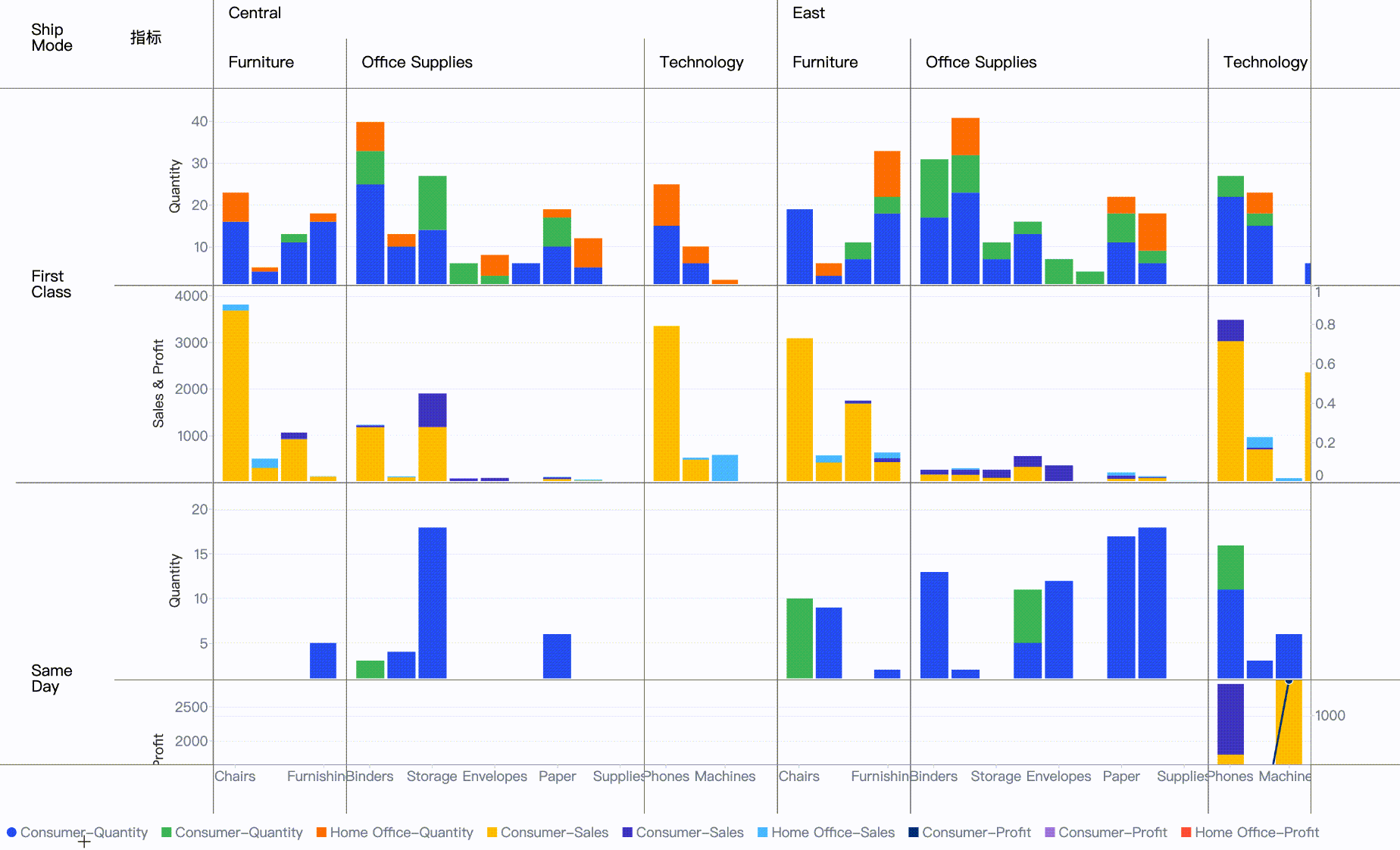
You can refer to the table [Legend Tutorial] (../components/legend) to configure the legend displayed outside the table. The configuration in the above picture is as follows:
     legends: {
      orient: 'bottom',
      type: 'discrete',
      data: [
        {
          label: 'Consumer-Quantity',
          shape: {
            fill: '#2E62F1',
            symbolType: 'circle'
          }
        },
        {
          label: 'Consumer-Quantity',
          shape: {
            fill: '#4DC36A',
            symbolType: 'square'
          }
        },
         {
          label: 'Home Office-Quantity',
          shape: {
            fill: '#FF8406',
            symbolType: 'square'
          }
        },
        {
          label: 'Consumer-Sales',
          shape: {
            fill: '#FFCC00',
            symbolType: 'square'
          }
        },
        {
          label: 'Consumer-Sales',
          shape: {
            fill: '#4F44CF',
            symbolType: 'square'
          }
        },
         {
          label: 'Home Office-Sales',
          shape: {
            fill: '#5AC8FA',
            symbolType: 'square'
          }
        },
        {
          label: 'Consumer-Profit',
          shape: {
            fill: '#003A8C',
            symbolType: 'square'
          }
        },
        {
          label: 'Consumer-Profit',
          shape: {
            fill: '#B08AE2',
            symbolType: 'square'
          }
        },
         {
          label: 'Home Office-Profit',
          shape: {
            fill: '#FF6341',
            symbolType: 'square'
          }
        }
      ]
    }
This configuration configures the color and shape of each item of the legend, as well as the label value.
Because the color values need to be explicitly set in this configuration, the color mapping rules also need to be specified in the spec of the configuration chart. Please refer to color configuration method.
In the example above, we added the following configuration to the chartSpec to ensure that the colors in the chart and the legend are consistent:
scales: [
              {
                id: 'color',
                type: 'ordinal',
                domain: [
                  'Consumer-Quantity',
                  'Corporate-Quantity',
                  'Home Office-Quantity',
                  'Consumer-Sales',
                  'Corporate-Sales',
                  'Home Office-Sales',
                  'Consumer-Profit',
                  'Corporate-Profit',
                  'Home Office-Profit'
                ],
                range: [
                  '#2E62F1',
                  '#4DC36A',
                  '#FF8406',
                  '#FFCC00',
                  '#4F44CF',
                  '#5AC8FA',
                  '#003A8C',
                  '#B08AE2',
                  '#FF6341',
                  '#98DD62',
                  '#07A199',
                  '#87DBDD'
                ]
              }
            ]
Legend linkage
Use the event LEGEND_ITEM_CLICK to monitor legend item clicks, and call the VTable interface updateFilterRules to process the data display filtered chart.
      const { LEGEND_ITEM_CLICK } = VTable.ListTable.EVENT_TYPE;
      tableInstance.on(LEGEND_ITEM_CLICK, args => {
        console.log('LEGEND_ITEM_CLICK', args);
        tableInstance.updateFilterRules([
          {
            filterKey: 'Segment-Indicator',
            filteredValues: args.value
          }
        ]);
      });