VSeed, an elegant data composer, transforming complexity into simplicity.
!!!###!!!title=gantt introduction——VisActor/VTable tutorial documents!!!###!!!!!!###!!!description=A Gantt chart is a project management tool used to display project plans, task progress, and schedules. It visually represents the start and end times of tasks using bar charts, helping project managers effectively track and manage project progress. Each task is displayed as a bar in the chart, with the length of the bar representing the duration of the task and the position representing the start and end times of the task.VTable-Gantt is a powerful Gantt chart drawing tool built on the VTable table component and the canvas renderer VRender, enabling developers to easily create and manage Gantt charts.!!!###!!!
Gantt Chart Introduction and Usage Guide
A Gantt chart is a project management tool used to display project plans, task progress, and schedules. It visually represents the start and end times of tasks using bar charts, helping project managers effectively track and manage project progress. Each task is displayed as a bar in the chart, with the length of the bar representing the duration of the task and the position representing the start and end times of the task.
VTable-Gantt is a powerful Gantt chart drawing tool built on the VTable table component and the canvas renderer VRender, enabling developers to easily create and manage Gantt charts.
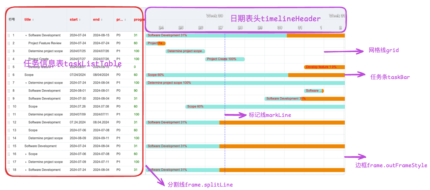
Components of a Gantt Chart
Task List on the Left: Displays the list of project tasks, usually on the left side of the chart.
Top Timeline: Displays the project's time range, usually at the top or bottom of the chart.
Task Bars: Represent the start and end times of each task.
Grid Lines: Separate the timeline and task bars, making the chart clearer.
Marker Lines: Mark important time points.
Divider Lines: Separate the task list and timeline, making the chart clearer.
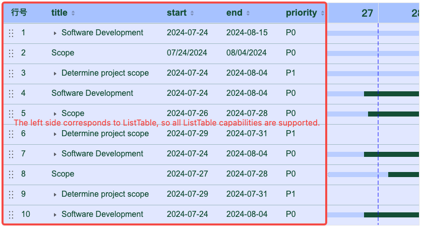
Note: The task information table on the left corresponds to a complete ListTable in the implementation. It is attached to ganttInstable.taskListTableInstance, so the interfaces and events corresponding to ListTable can be directly used through taskListTableInstance. If you want to troubleshoot issues with the table on the left, you can also directly extract taskListTableInstance.options to check if they meet expectations.
left table
Main Capabilities of Gantt Chart
Multi-column Information Display
The left side of the entire structure of the Gantt chart is a complete table container, so it supports rich column information display. For specific configuration, please refer to Configuration.
Custom Rendering
Custom rendering requires understanding the graphic element properties of VRender. For details, please refer to Custom Rendering Tutorial.
Custom Rendering of Task Bars
You can customize the rendering of task bars through the taskBar.customLayout configuration item.
Custom Rendering of Date Headers
You can customize the rendering of date headers through the timelineHeader.scales.customLayout configuration item.
Custom Rendering of Task Information Table on the Left
You can define the custom rendering of each cell in each column through taskListTable.columns.customLayout or globally define the custom rendering of each cell through taskListTable.customLayout.
Support for Different Date Scale Granularity
In common business scenarios, multi-level time scale display may be required. VTable-Gantt supports five time granularities: 'day' | 'week' | 'month' | 'quarter' | 'year' | 'hour' | 'minute' | 'second'.
You can set the row height and time unit (such as day, week, month, etc.) of the date scale through the timelineHeader.scale configuration item.
Date Header Style
You can customize the style of the date header through the timelineHeader.scales.style configuration item.
You can set the row height of the date scale through the timelineHeader.scales.rowHeight configuration item.
Outer Frame
The border of the table may have a different style from the internal grid lines. You can customize the outer frame of the Gantt chart through the frame.outerFrameStyle configuration item.
Horizontal and Vertical Divider Lines
Supports horizontal divider lines for both the header and body, as well as divider lines between the left information table and the right task list. You can customize the style of horizontal divider lines through the frame.horizontalSplitLine configuration item. You can customize the style of vertical divider lines through the frame.verticalSplitLine configuration item.
Marker Lines
In the Gantt chart, it is often necessary to mark some important dates. We configure this effect through the markLine configuration item. You can specify key dates through markLine.date and customize the style of marker lines through the markLine.style configuration item. If you need to ensure that the date is displayed at initialization, you can set markLine.scrollToMarkLine to true. Marker lines support dynamic creation. For details, please refer to the example.
Container Grid Lines
You can customize the style of the background grid lines of the right task bars through the grid configuration item, including background color, line width, line type, etc.
Dependencies between tasks
Through the dependency.links configuration item, you can set the dependencies between tasks. Note that the configuration data format of the dependency is:
  export type ITaskLink = {
    /** Dependency type */
    type: DependencyType;
    linkedFromTaskKey?: string | number;
    linkedToTaskKey?: string | number;
  };
The values of linkedFromTaskKey and linkedToTaskKey need to correspond to the unique identifier field in the records, with the default field name being id. If you need to modify it, you can do so through the taskKeyField configuration item.
Interaction
Dragging Task Bars
You can set whether task bars are draggable through the taskBar.moveable configuration item.
Resizing Task Bars
You can set whether task bars are resizable through the taskBar.resizable configuration item.
Adjusting the Progress of Task Bars
You can set whether task bars are adjustable through the taskBar.progressAdjustable configuration item.
Task Bar Locate
When the timeline is long and the task bar is outside the current viewport, you can enable the “locate icon” feature: an icon is shown on the left/right edge of the gantt view, and clicking it scrolls the task bar into the viewport.
Key option:
const option = {
  taskBar: {
    locateIcon: true
  }
};
Adjusting the Width of the Left Table
You can set the divider line to be draggable by configuring frame.verticalSplitLineMoveable to true.
Editing Task Information
You can synchronize data updates to the task bars through the editing capabilities of ListTable.
To enable editing capabilities, you need to register the editor to VTable in advance, as the editing capabilities here actually rely on the editing capabilities of ListTable.
Adjusting Data Order
To enable drag-and-drop reordering capabilities, you need to add rowSeriesNumber to the configuration of ListTable, which provides a row number. You can configure the style of this column using rowSeriesNumber.style and headerStyle. To enable reordering, set rowSeriesNumber.dragOrder to true. VTable-Gantt will synchronize the order to the task bar area display when a reordering event is detected.
Create association lines
Through the dependency.linkCreatable configuration item, you can set whether the association line can be created.
Creation Schedule
Configuration taskBar. ScheduleCreatable.
If there is no field data for the task date in the original data, you can create a schedule to specify a start time and end time for the task. By default, when you hover over a grid without date data, a button to add a schedule will appear.
The button style can be configured via taskBar.scheduleCreation.buttonStyle.
If the current configuration does not meet your needs, you can also customize the display effect of the creation schedule through the taskBar.scheduleCreation.customLayout configuration item.
Note: Different Gantt chart instances have different capabilities to create schedules.
When tasksShowMode is TasksShowMode.Tasks_Separate or TasksShowMode.Sub_Tasks_Separate, that is, each piece of data has a corresponding row position display, but the data does not set the startDate and endDate fields, a create button will appear when the mouse hovers over the row, and clicking the button will create a schedule and display the task bar.
When tasksShowMode is TasksShowMode.Sub_Tasks_Inline, TasksShowMode.Sub_Tasks_Arrange, or TasksShowMode.Sub_Tasks_Compact, it is necessary to explicitly set scheduleCreatable to true for the create button to appear. When the mouse hovers over the blank area, the create button will be displayed, and clicking the button will trigger the event GANTT_EVENT_TYPE.CREATE_TASK_SCHEDULE, but it will not actually create the task schedule. The user needs to listen to this event and create the schedule update data according to business requirements.
Leveraging the Capabilities of the Table
The Gantt chart is implemented based on the ListTable of VTable. It looks like a spliced form, with the task information table on the left and the task bar list on the right.
The taskListTable is one of the most important configuration items in the vtable-gantt component. It is used to configure the layout and style of the task list table on the left, corresponding to a complete ListTable configuration. In the Gantt chart instance, there is also such a ListTable instance, which can be directly obtained for operations.
The way to get the table instance is as follows:
const ganttInstance = new Gantt(containerDom, options);
// Get the table instance on the leftconst tableInstance = ganttInstance.taskListTableInstance;
The capabilities implemented by VTableGantt using this table instance tableInstance include:
Using this indirectly obtained tableInstance, you can listen to events or call the interfaces supported by ListTable. For details, refer to the ListTable documentation.
Using the editing capabilities of ListTable, the data editing capabilities of the Gantt chart are implemented.
Using the sorting capabilities of ListTable, the data sorting capabilities of the Gantt chart are implemented. Refer to the ListTable tutorial.
Using the tree structure capabilities of ListTable, the parent-child relationship data of the Gantt chart is implemented. Refer to the ListTable tutorial.
Main Configuration of vtable-gantt
In the vtable-gantt component, the main supported configurations include:
Data Configuration records
Task Bar Configuration taskBar
Custom Rendering: You can customize the rendering of task bars through the customLayout configuration item.
Style Configuration: You can set the style of task bars, including color, width, border radius, border, etc., through configuration items barStyle.
Text Style: You can configure the displayed text content information through labelText and configure the text style through labelTextStyle, including font, color, alignment, etc.
Interaction Configuration: You can set whether task bars are resizable and movable through the resizable and moveable configuration items.
Interaction Style: You can set the style of task bars when hovering and when selected through the hoverBarStyle and selectedBarStyle configuration item.
Dependency Line dependency
Introduction to related configuration items for task dependencies:
dependency.links:You can set the dependencies between tasks through the dependency.links configuration item.
taskKeyField:You can set the field name of the unique identifier field for dependencies through the taskKeyField configuration item.
dependency.linkLineStyle:You can configure the style of dependency lines, including color, width, dashed style, etc., through dependency.linkLineStyle.
dependency.linkLineSelectedStyle:You can customize the style of dependencies when selected between tasks.
dependency.linkCreatable:You can set whether association lines can be created through the dependency.linkCreatable configuration item.
dependency.linkSelectable:You can set whether association lines can be selected through the dependency.linkSelectable configuration item.
dependency.linkDeletable:You can set whether association lines can be deleted through the dependency.linkDeletable configuration item. If you want to delete association lines through the right-click menu, you can listen to the CONTEXTMENU_DEPENDENCY_LINK event to actively call the deleteLink interface to delete. If you configure shortcut keys keyboardOptions.deleteLinkOnDel or keyboardOptions.deleteLinkOnBack to delete association lines by pressing the 'del' or 'back' key on the keyboard.
Operation style during the creation of association lines: You can set the style of the association line selection process, including color, width, dashed style, etc., through the linkSelectedLineStylelinkCreatePointStylelinkCreatingPointStylelinkCreatingLineStyle configuration items.
Date Header Configuration timelineHeader
Custom Rendering: You can customize the rendering of date headers through the customLayout configuration item.
Style Configuration: You can set the text style of the header, including font size, color, alignment, etc., through the style configuration item.
Weekend column width: You can set weekend column width through timelineHeader.weekendColWidth, or hide weekend columns through timelineHeader.hideWeekend (only effective when the smallest time scale is unit: 'day' and step: 1).
Time Scale Configuration timelineHeader.scales
Row Height and Time Unit: You can set the row height and time unit (such as day, week, month, etc.) of the time scale through the rowHeight and unit configuration items.
Step Length and Week Start Day: You can set the step length of the time scale and the start day of the week through the step and startOfWeek configuration items.
Date Formatting: You can customize the display format of dates through the format configuration item.
Whether to display the corresponding date grid in the header part: You can set whether to display the date grid in the header part through the visible configuration item, the default is displayed.
Grid Line Configuration grid
Style Configuration: You can set the color, width, dashed style, etc., of grid lines through the verticalLine and horizontalLine configuration items.
Background Color: You can set the background color of grid lines through the backgroundColor configuration item.
Task List Table Configuration taskListTable (Configuration of the task information list ListTable on the left, refer to Configuration)
Overall Width of the Table on the Left: You can set the overall width of the task list table through the tableWidth configuration item.
Column Information: You can define the column information and width of each column of the task information table through columns.
Style Configuration: You can set the style of the header and body through the theme.headerStyle and theme.bodyStyle configuration items.
Width Limit: You can set the minimum and maximum width of the task list through the minTableWidth and maxTableWidth configuration items.
Divider Line Configuration frame
Outer Frame Configuration: You can set the color, width, etc., of the outer frame through the outerFrameStyle configuration item.
Divider Line Style Configuration: You can set the color, width, dashed style, etc., of divider lines through the verticalSplitLine and horizontalSplitLine configuration items.
Dragging the Width of the Table on the Left: You can set whether the divider line is draggable through the verticalSplitLineMoveable configuration item. You can set the highlight line style when adjusting the column width through the verticalSplitLineHighlight configuration item.
Marker Line Configuration markLine
Date Configuration: You can set the date of the marker line through the date configuration item.
Style Configuration: You can set the color, width, dashed style, etc., of the marker line through the style configuration item.
Marker Line Position: You can set the position of the marker line through the position configuration item.
Default Display of Marker Line in the Middle: You can set whether the marker line is displayed in the middle by default through the scrollToMarkLine configuration item.
These capabilities make the vtable-gantt component highly customizable and flexible in task management and project planning, meeting the needs of different scenarios.
Summary
The Gantt chart is a very important tool in project management. By visually displaying the progress and schedule of the project, it helps project managers better plan and control the project. By reasonably configuring the various parameters of the Gantt chart, it can meet the needs of different projects and improve the efficiency of project management.
I hope this tutorial can help you better understand and use the Gantt chart. If you have any questions or suggestions, feel free to discuss and exchange ideas.
