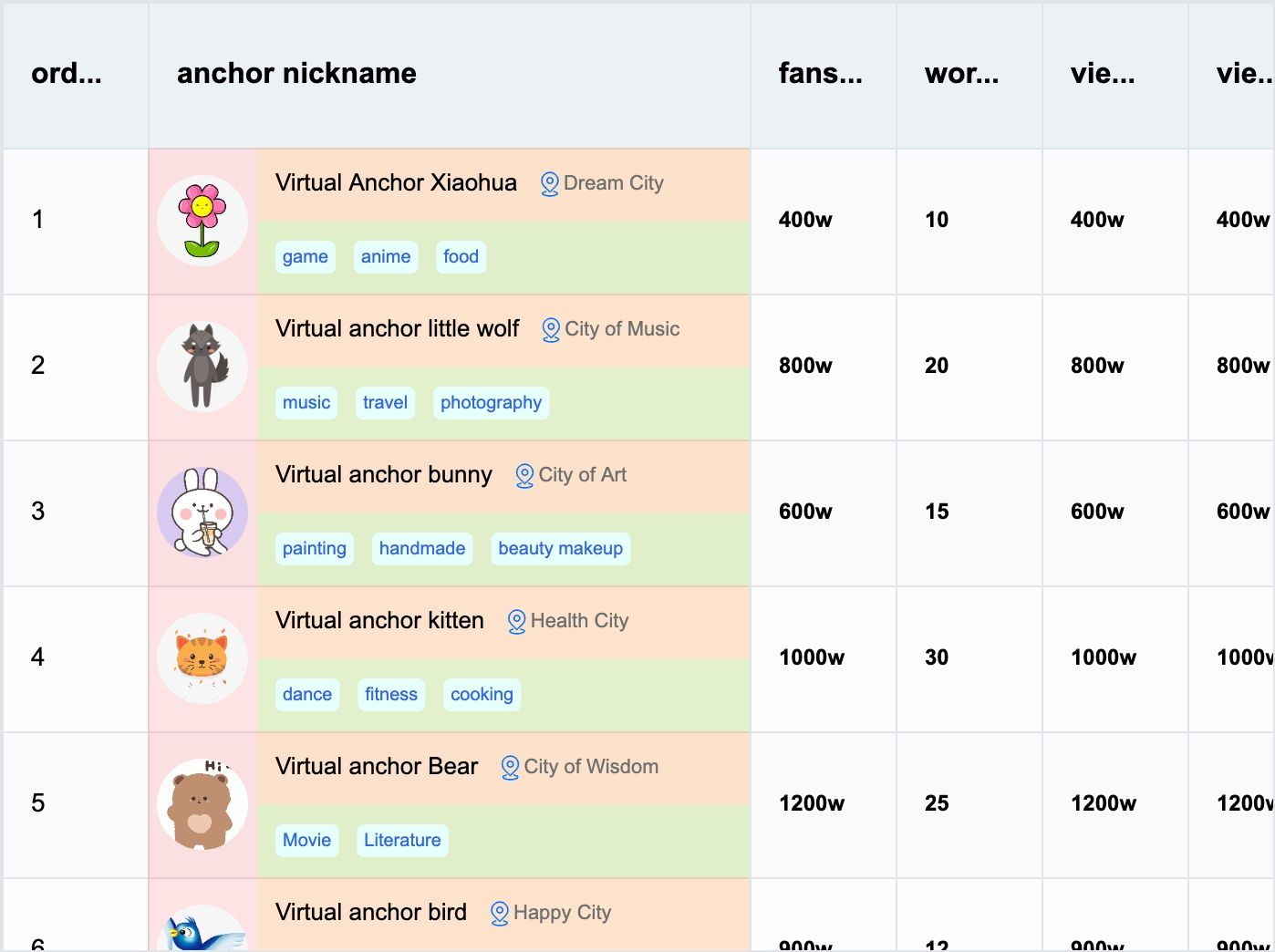
To help react developers quickly implement custom cell content, React-VTable provides the ability to encapsulate components and use them in cells.
Component usage
To use custom cell component, need to use react 18 version
Custom cell components are encapsulated based on custom layout, and their usage is similar to custom layout. To use components in ListColumn, custom components need to pass in the role attribute to identify the component as a custom cell component; the custom-layout component will take effect in the table content part, and the header-custom-layout component will take effect in the table header part. There can be at most one custom-layout component in each column, and at most one header-custom-layout component.
In the component, in addition to user-defined properties, like custom layouts, react-vtable also provides some default properties for components to use
The label returned by the component must be based on the element label provided by react-vtable (HTML tags or DOM react components cannot be used directly. If you need to use them, please refer to the next section)
It should be noted that the Popover component uses the DOM solution, and ReactDom needs to be passed in the ReactDOM attribute, otherwise it cannot be rendered normally; the ReactNode type received by the content attribute needs to be a DOM tag or component, otherwise it cannot be rendered normally.
The React-VTable component library is being continuously enriched. Developers are welcome to encapsulate new components during use and build a component library ecosystem together.
Use DOM react components
If you need to use DOM react components in components, you can specify the react attribute in the attribute property of the element component and pass the react component as the element property:
The following properties are also supported in react:
pointerEvents whether to respond to mouse events
penetrateEventList Mouse event penetration list, used to specify which mouse events need to be penetrated to the VTable (currently only supports wheel)
container Container, used to limit the component display area in the table when scrolling. If you need to limit the component display in the table content area, you need to specify it as table.bodyDomContainer; if you need to limit the component display in the table header area, you need to specify it as table.headerDomContainer; if it is a pop-up window or menu component, you do not need to configure this property
anchorType Anchor type, used to specify the anchor position of the upper left corner of the component relative to the cell
'top'
'bottom'
'left'
'right'
'top-right'
'top-left'
'bottom-right'
'bottom-left'
'center'
We recommend that users use the meta tags provided by react-vtable for the content displayed in the cell. For pop-ups, menus and other components triggered in the cell, you can use DOM react components. This is the best performance solution. Reference example.
If you need to display content in a cell, use DOM react components. You need to specify react.container according to the restrictions on components displayed in the table content area. It should be noted that this method requires frequent updates of component-related DOM, which will have a certain impact on performance. You can refer to custom layout. We strongly recommend that the content components in the cell use the meta tags provided by react-vtable, which is the best solution for performance.
Custom external components
In order to facilitate the overlay of external components on the React-VTable component, React-VTable provides the CustomComponent tool component, which allows you to quickly locate external components in the table, and can be used to quickly implement functional components such as pop-ups and menus.
Among them, CustomComponent is used as a container to position in the table and automatically match the size (based on the anchored cell). There are two specific ways to use it:
Absolute positioning
For absolute positioning, you need to specify displayMode as position, and you need to specify x and y attributes to position the container to the specified pixel position in the table (based on the upper left corner). The width and height attributes specify the pixel size of the container.
Relative positioning
For relative positioning, you need to specify displayMode as cell, the container is positioned relative to the cell, the col and row attributes are used to specify the anchored cell coordinates, the anchor attribute specifies the anchor position of the container relative to the cell, the dx and dy attributes specify the offset of the container relative to the anchored cell, and the width and height attributes specify the size of the container. The dxdywidth and height attributes all support units of pixels or percentages. When the percentage is calculated relative to the size of the cell.
