VSeed, an elegant data composer, transforming complexity into simplicity.
!!!###!!!title=checkbox——VisActor/VTable tutorial documents!!!###!!!!!!###!!!description=Checkbox cell type is suitable for providing multiple-choice options in tables, allowing users to select or deselect one or more items. Checkbox cells are widely used in many applications, including task management, data filtering, permission settings, and more.The advantages of checkbox cells in tables are:1. Checkbox cells are intuitive and flexible to use. Users can select one or multiple options based on their needs to perform specific operations or filter data. This interaction method allows users to have more precise control over their operations, improving user experience and efficiency.2. Checkbox cells typically use different icons or colors to represent checked and unchecked states, providing visual feedback. This makes it easy for users to identify which options have been selected and which haven't.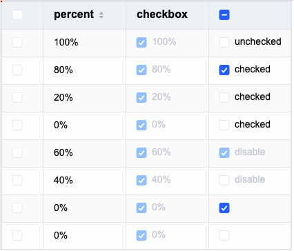!!!###!!!
Checkbox Cell Type
Checkbox cell type is suitable for providing multiple-choice options in tables, allowing users to select or deselect one or more items. Checkbox cells are widely used in many applications, including task management, data filtering, permission settings, and more.
The advantages of checkbox cells in tables are:
Checkbox cells are intuitive and flexible to use. Users can select one or multiple options based on their needs to perform specific operations or filter data. This interaction method allows users to have more precise control over their operations, improving user experience and efficiency.
Checkbox cells typically use different icons or colors to represent checked and unchecked states, providing visual feedback. This makes it easy for users to identify which options have been selected and which haven't.
Checkbox-specific Configuration Options
The checkbox type has the following specific configuration options:
checked: Determines whether the cell is in a checked state. Default value is false. Supports function configuration for different cells.
disable: Determines whether the checkbox can be disabled. Default value is false. Supports function configuration for different cells.
Example:
{
headerType: 'checkbox', // Specify header cell to display as checkboxcellType: 'checkbox', // Specify body cell to display as checkboxfield: 'check',
checked: true,
disable: false}
Checkbox Data Types
Checkbox data supports boolean, string, or Object types, or defaults to false if no value is set.
Setting boolean type is most common. Example with check field:
const columns = [
{
headerType: 'checkbox', // Specify header cell to display as checkboxcellType: 'checkbox', // Specify body cell to display as checkboxfield: 'check' }
];
const records = [
{
product: 'a',
check: true },
{
product: 'b',
check: false },
{
product: 'c',
check: false }
];
If set as a string type, the text will be displayed to the right of the checkbox, with the checkbox defaulting to unchecked. Example with product field:
const columns = [
{
headerType: 'checkbox', // Specify header cell to display as checkboxcellType: 'checkbox', // Specify body cell to display as checkboxfield: 'product' }
];
const records = [
{
product: 'a' },
{
product: 'b' },
{
product: 'c' }
];
If each data entry has different states, you can set an Object.
In tree structure, you can configure the cellType: 'checkbox' property in rowSeriesNumber to display checkboxes in the tree structure. After enabling, checkboxes will appear in the tree structure and synchronize with the selected status of child elements.
We also support configuring the cellType: 'checkbox' property in the columnDefine where tree is true to display checkboxes in the tree structure. After enabling, checkboxes will appear in the tree structure and synchronize with the selected status of child elements.
columns: [{
  tree: true,
  cellType: 'checkbox'
}]
or
rowSeriesNumber: {
  cellType: 'checkbox'
}
If you don't want to associate the selected status of parent and child nodes, you can configure the enableCheckboxCascade property to enable or disable the group checkbox cascade function. The same applies to the checkbox configured in the column.
If you don't want to associate the selected status of the header and body cells, you can configure the enableHeaderCheckboxCascade property to enable or disable the header checkbox cascade function.
When enableCheckboxCascade is true, enableHeaderCheckboxCascade is true. When enableCheckboxCascade is false, enableHeaderCheckboxCascade is false.
With the above introduction, you've learned how to use checkbox cell types for data display in VTable. We hope this helps!

