Vue-VTable Custom Component
Custom Cell Component
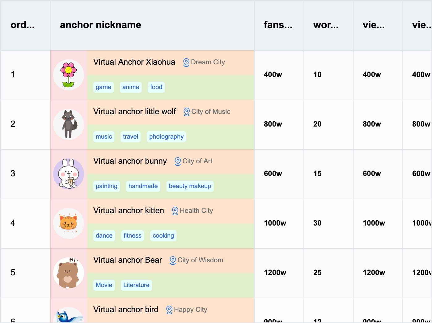
To facilitate Vue developers in quickly implementing custom cell content, Vue-VTable provides the capability to encapsulate components and use them within cells.
Component Usage
The custom cell component is encapsulated based on the custom layout and is used similarly to custom layouts. In ListColumn, you can use the component through the #customLayout slot and the <ListColumn> component to customize column rendering using templates. The #customLayout slot returns the following parameters:
interface CustomLayoutProps {
  table: ListTable; // Table instance
  row: number; // Row number
  col: number; // Column number
  value: FieldData; // Cell display data
  dataValue: FieldData; // Original cell data
  rect?: RectProps; // Cell layout information
}
The example code demonstrates how to use the ListColumn component within the ListTable component and customize column rendering through the #customLayout slot. The specific implementation includes using the Group component to layout cell content.
import { ListTable, ListColumn } from '@visactor/vue-vtable';
import { Group, Text, Image, Radio, CheckBox, Tag } from '@visactor/vue-vtable';
import * as VTable from '@visactor/vtable';

<ListTable>
  <ListColumn :field="'bloggerName'" :title="'anchor nickname'" :width="330" :style="{ fontFamily: 'Arial', fontWeight: 500 }">

    <template #customLayout="{ table, row, col, rect, record, height, width }">

      <Group :height="height" :width="width" display="flex" flexDirection="row" flexWrap="nowrap">
        <!-- Avatar Group -->
        <Group :height="height" :width="60" display="flex" flexDirection="column" alignItems="center" justifyContent="space-around">
          <Image id="icon0" :width="50" :height="50" :image="record.bloggerAvatar" :cornerRadius="25" />
        </Group>
        <!-- Blogger Info Group -->
        <Group :height="height" :width="width - 60" display="flex" flexDirection="column" flexWrap="nowrap">
          <!-- Blogger Name and Location -->
          <Group :height="height / 2" :width="width" display="flex" alignItems="flex-end">
            <Text ref="textRef" :text="record.bloggerName" :fontSize="13" fontFamily="sans-serif" fill="black" />
            <Image id="location" image="https://lf9-dp-fe-cms-tos.byteorg.com/obj/bit-cloud/VTable/location.svg"
              :width="15" :height="15" :boundsPadding="[0, 0, 0, 10]" cursor="pointer"
              @mouseEnter="handleMoueEnter($event)" @click="handleMouseClick($event)" @mouseLeave="handleMoueLeave($event)" />
            <Text :text="record.city" :fontSize="11" fontFamily="sans-serif" fill="#6f7070" />
          </Group>
          <!-- Tags Group -->
          <Group :height="height / 2" :width="width" display="flex" alignItems="center">
            <Tag v-for="tag in record?.tags" :key="tag" :text="tag" :textStyle="{ fontSize: 10, fontFamily: 'sans-serif', fill: 'rgb(51, 101, 238)' }" :panel="{ visible: true, fill: '#f4f4f2', cornerRadius: 5 }" :space="5" :boundsPadding="[0, 0, 0, 5]" />
          </Group>
        </Group>
      </Group>

    </template>

  </ListColumn>
</ListTable>
Component Encapsulation
Tags
The tags returned by the component must be based on the graphical tags provided by vue-vtable (HTML tags or Vue components cannot be used directly).
import { ListTable, ListColumn } from '@visactor/vue-vtable';
import { Group, Text, Image, Radio, CheckBox, Tag } from '@visactor/vue-vtable';
import * as VTable from '@visactor/vtable';

<ListTable>
  <ListColumn :field="'bloggerName'" :title="'anchor nickname'" :width="330" :style="{ fontFamily: 'Arial', fontWeight: 500 }">

    <template #customLayout="{ table, row, col, rect, record, height, width }">

      <!-- Blogger Name and Location -->
      <Group :height="height / 2" :width="width" display="flex" alignItems="flex-end">
        <Text ref="textRef" :text="record.bloggerName" :fontSize="13" fontFamily="sans-serif" fill="black" />
        <Image
          id="location"
          image="https://lf9-dp-fe-cms-tos.byteorg.com/obj/bit-cloud/VTable/location.svg"
          :width="15"
          :height="15"
          :boundsPadding="[0, 0, 0, 10]"
          cursor="pointer"
          @mouseEnter="handleMoueEnter($event)"
          @click="handleMouseClick($event)"
          @mouseLeave="handleMoueLeave($event)"
        />
        <Text :text="record.city" :fontSize="11" fontFamily="sans-serif" fill="#6f7070" />
      </Group>

    </template>

  </ListColumn>
</ListTable>
Basic Primitive Components
Basic primitives:
- Group
- Text
- Image
- Radio
- CheckBox
- Tag
For specific configuration properties, refer to VRender Primitive Configuration. For specific usage and layout, refer to custom layout and reference examples.