VSeed, an elegant data composer, transforming complexity into simplicity.
!!!###!!!title=switch——VisActor/VTable tutorial documents!!!###!!!!!!###!!!description=Switch cell type is suitable for providing switch states in tables, allowing users to select or deselect one or more items. The interactive capability provided by switch cell type is widely used in many applications.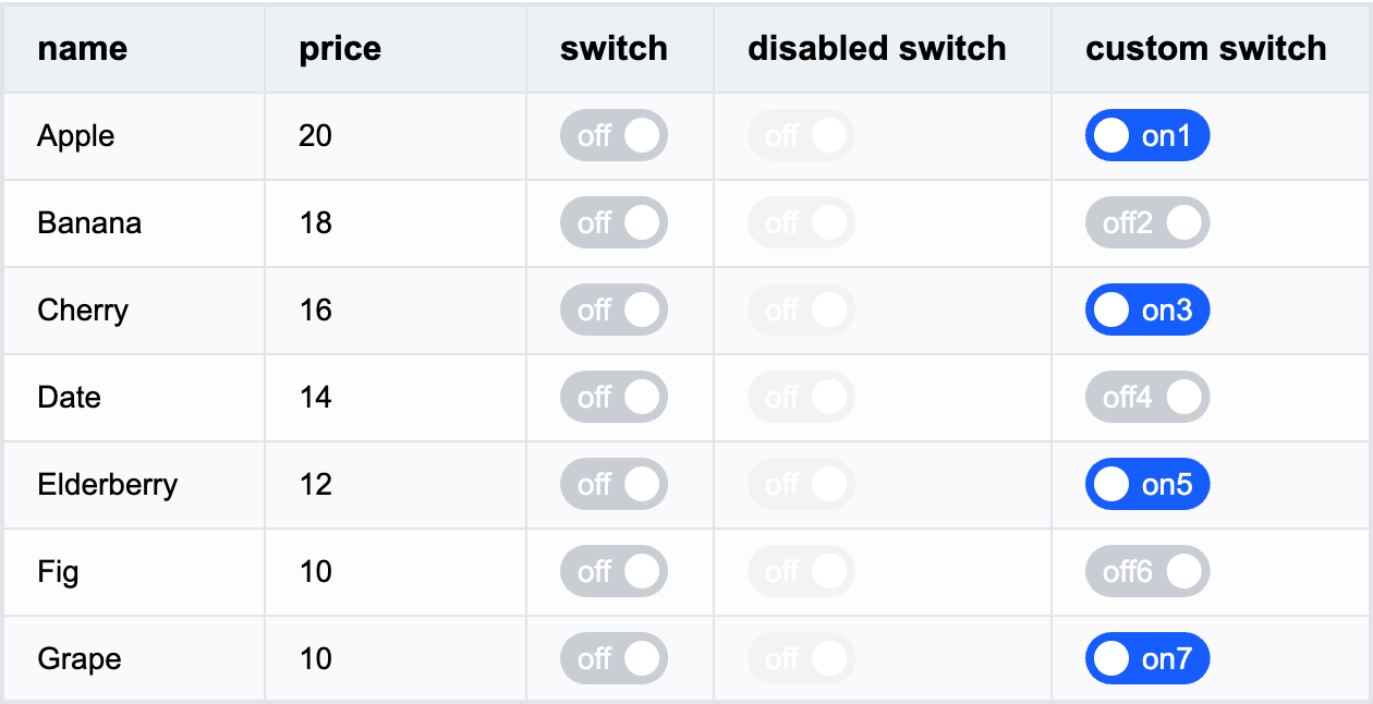!!!###!!!
Switch Cell Type
Switch cell type is suitable for providing switch states in tables, allowing users to select or deselect one or more items. The interactive capability provided by switch cell type is widely used in many applications.
Switch-specific Configuration Options
The switch cell type has the following specific configuration options:
checked: Whether the cell is in checked state, default value is false. Supports function configuration, can be different for different cells.
disable: Whether the switch can be disabled for clicking, default value is false. Supports function configuration, can be different for different cells.
checkedText: Specifies the text for checked state, supports function configuration.
uncheckedText: Specifies the text for unchecked state, supports function configuration.
Example:
{
field: 'switch', // Specify the cell's fieldcellType: 'switch', // Specify the cell to display as switch typechecked: true,
disable: false,
checkedText: 'on', // Specify text for checked state, supports function configurationuncheckedText: 'off', // Specify text for unchecked state, supports function configurationstyle: {
// Specify text stylecolor: '#FFF',
// ......// Specify switch styleswitchStyle: {
boxWidth: 40, // Specify switch widthboxHeight: 20, // Specify switch height// ...... }
}
}
Switch Data Types
The switch cell type supports boolean or Object data types, or defaults to false if no value is set.
Setting boolean type is most common among the three types. Example switch field configuration:
Click to view complete example
Through the above introduction, you have learned how to use switch cell type for data display in VTable. We hope this helps.

