!!!###!!!title=custom render(JSX)——VisActor/VTable tutorial documents!!!###!!!

Custom Rendering Auto Layout

Introduction

This tutorial mainly introduces how to use CustomLayout to achieve auto layout.

- Note: If you want to implement a fully customized layout by defining coordinates, you can refer to the tutorial: CustomRender. The CustomRender approach supports users in customizing the elements needed within a cell, using a callback function to return an array of elements, specifying the type, style, and coordinates of the elements (VTable CustomRender layout capability design). However, this method is more low-level, and if users want to implement a complex style, they need to manually calculate the positions of various elements, and manually handle alignment, line wrapping, and other functions, which is relatively difficult to get started with and has low maintainability. -

CustomLayout provides a simple box model layout capability on top of the CustomRender API. Users can achieve basic layout capabilities such as alignment and wrapping by configuring containers and elements, facilitating the implementation and maintenance of more complex cell content. VTable uses the graphical and layout capabilities provided by VRender to implement the customLayout function. Currently, the use of JSX syntax is recommended for its clearer hierarchical structure, see example.

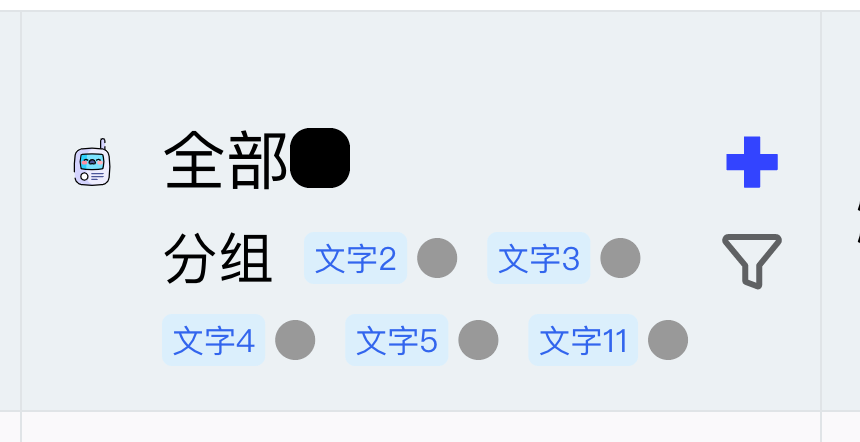
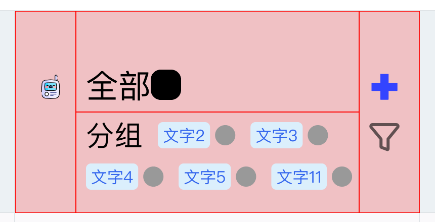
Below is a relatively complex text and icon mixed layout implemented using CustomLayout (red indicates the bounds of different containers):

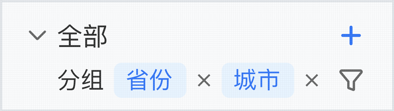
CustomLayout Configuration

Similar to customRender, customLayout is divided into two interfaces: customLayout and headerCustomLayout, to configure custom rendering for headers and content respectively, within columns/rows.

const option = {
  columns: [
    {
      // ......
      customLayout: (args: VTable.TYPES.CustomRenderFunctionArg) => {
        // ......
      }
    }
  ]
};

The customLayout function returns an object, which needs to include: rootContainer to specify the root node for the custom rendering content, and renderDefault to specify whether the original cell content needs to be rendered (consistent with customRender).

Here is a configuration example, where VGroup, VImage, and VText are used, and finally returned:

{
  customLayout: args => {
    const { table, row, col, rect } = args;
    const { height, width } = rect ?? table.getCellRect(col, row);
    const record = table.getCellOriginRecord(col, row);

    const container = (
      <VGroup
        attribute={{
          id: 'container',
          width,
          height,
          display: 'flex',
          flexWrap: 'wrap',
          justifyContent: 'flex-start',
          alignContent: 'center'
        }}
      >
        <VGroup
          attribute={{
            id: 'container-left',
            width: 60,
            height,
            fill: 'red',
            opacity: 0.1,
            display: 'flex',
            justifyContent: 'space-around',
            alignItems: 'center'
          }}
        >
          <VImage
            attribute={{
              id: 'icon0',
              width: 50,
              height: 50,
              image: record.bloggerAvatar,
              cornerRadius: 25
            }}
          ></VImage>
        </VGroup>
        <VGroup
          id="container-right"
          attribute={{
            id: 'container-right',
            width: width - 60,
            height,
            fill: 'yellow',
            opacity: 0.1,
            display: 'flex',
            flexDirection: 'column',
            justifyContent: 'space-around',
            alignItems: 'center'
          }}
        >
          <VGroup
            attribute={{
              id: 'container-right-top',
              fill: 'red',
              opacity: 0.1,
              width: width - 60,
              height: height / 2,
              display: 'flex',
              flexWrap: 'wrap',
              justifyContent: 'flex-start',
              alignItems: 'center'
            }}
          >
            <VText
              attribute={{
                id: 'bloggerName',
                text: record.bloggerName,
                fontSize: 13,
                fontFamily: 'sans-serif',
                fill: 'black',
                textAlign: 'left',
                textBaseline: 'top',
                boundsPadding: [0, 0, 0, 10]
              }}
            ></VText>
            <VImage
              attribute={{
                id: 'location-icon',
                width: 15,
                height: 15,
                image:
                  '<svg t="1684484908497" class="icon" viewBox="0 0 1024 1024" version="1.1" xmlns="http://www.w3.org/2000/svg" p-id="2429" width="200" height="200"><path d="M512 512a136.533333 136.533333 0 1 1 136.533333-136.533333 136.533333 136.533333 0 0 1-136.533333 136.533333z m0-219.272533a81.92 81.92 0 1 0 81.92 81.92 81.92 81.92 0 0 0-81.92-81.92z" fill="#0073FF" p-id="2430"></path><path d="M512 831.214933a27.306667 27.306667 0 0 1-19.2512-8.055466l-214.493867-214.357334a330.5472 330.5472 0 1 1 467.490134 0l-214.357334 214.357334a27.306667 27.306667 0 0 1-19.387733 8.055466z m0-732.091733a275.933867 275.933867 0 0 0-195.106133 471.04L512 765.269333l195.106133-195.106133A275.933867 275.933867 0 0 0 512 99.1232z" fill="#0073FF" p-id="2431"></path><path d="M514.321067 979.490133c-147.456 0-306.107733-37.000533-306.107734-118.3744 0-45.602133 51.746133-81.92 145.681067-102.4a27.306667 27.306667 0 1 1 11.605333 53.384534c-78.370133 17.066667-102.673067 41.915733-102.673066 49.015466 0 18.432 88.064 63.761067 251.4944 63.761067s251.4944-45.192533 251.4944-63.761067c0-7.3728-25.258667-32.768-106.496-49.834666a27.306667 27.306667 0 1 1 11.195733-53.384534c96.6656 20.343467 150.186667 56.9344 150.186667 103.2192-0.273067 80.964267-158.9248 118.3744-306.3808 118.3744z" fill="#0073FF" p-id="2432"></path></svg>',
                boundsPadding: [0, 0, 0, 10]
              }}
            ></VImage>
            <VText
              attribute={{
                id: 'locationName',
                text: record.city,
                fontSize: 11,
                fontFamily: 'sans-serif',
                fill: '#6f7070',
                textAlign: 'left',
                textBaseline: 'top'
              }}
            ></VText>
          </VGroup>
          <VGroup
            attribute={{
              id: 'container-right-bottom',
              fill: 'green',
              opacity: 0.1,
              width: width - 60,
              height: height / 2,
              display: 'flex',
              flexWrap: 'wrap',
              justifyContent: 'flex-start',
              alignItems: 'center'
            }}
          >
            {record?.tags?.length
              ? record.tags.map((str, i) => (
                  <VTag
                    attribute={{
                      text: str,
                      textStyle: {
                        fontSize: 10,
                        fontFamily: 'sans-serif',
                        fill: 'rgb(51, 101, 238)'
                      },
                      panel: {
                        visible: true,
                        fill: '#e6fffb',
                        lineWidth: 1,
                        cornerRadius: 4
                      },
                      boundsPadding: [0, 0, 0, 10]
                    }}
                  ></VTag>
                ))
              : null}
          </VGroup>
        </VGroup>
      </VGroup>
    );

    return {
      rootContainer: container,
      renderDefault: false
    };
  };
}

Layout Capabilities

Taking this header as an example

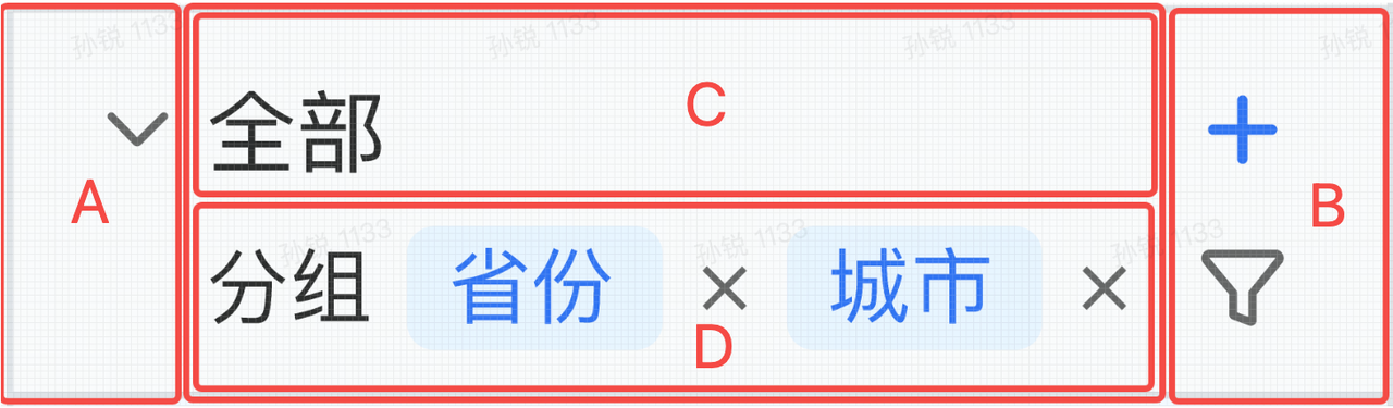
It is divided into five containers: A, B, CD, C, and D

The header part is laid out horizontally, divided into three sections (A, B, CD):

  • The left and right sides (A, B), with specified pixel width (determined by the icon size), and the height equal to the cell height
  • The middle part (CD) has the cell height, with the specified width being the cell width minus the total width of AB

The middle part is laid out vertically, divided into two sections (C, D):

  • The upper part (C) has a specified height (determined by the "all" text style), and the width is the width of the parent container
  • The lower part (D) does not have a specified height; its width is the width of the parent container, and the actual height is determined by the layout result, with parts exceeding the container being truncated

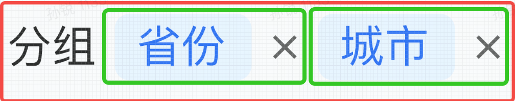
The lower middle part (D) is laid out horizontally, with three elements: group text, province button, and city button

The province and city buttons are composed of multiple elements, and the height of the entire container is determined by the layout wrap result. The minimum height is when it is displayed in one line without wrapping; the maximum height is when all three elements are wrapped and displayed in three lines.

JSX Primitives

For detailed instructions, please refer to the tutorial provided by VRender: VRender Primitive Configuration

Container Primitives

Container primitives VGroup are box model layout containers that support automatic layout of elements within them; VGroup's child elements can be VGroup or basic primitives; layout supports configuring the following properties:

  • display: Layout mode (flex activates flex layout mode)
  • flexDirection: The direction of the main axis
  • flexWrap: Whether to display in a single line or multiple lines
  • justifyContent: Rules for distributing space between and around content elements along the row axis
  • alignItems: Alignment rules on the cross axis
  • alignContent: Alignment rules on the main axis

Basic Primitives

Basic custom primitives currently support VRect, VCircle, VText, VImage

Primitive TypeBasic Properties
rectwidth, height, stroke, fill, lineWidth, cornerRadius...
circleradius, startAngle, endAngle, stroke, fill, lineWidth...
texttext, fontSize, fontFamily, fill...
imageimage, width, height

Basic custom components currently support VTag

Primitive TypeBasic Properties
tagtext, textStyle, shape, padding...
radiochecked, disabled, text, icon...
checkboxchecked, disabled, text, icon...

Primitives can be configured with the boundsPadding property to achieve a margin effect boundsPadding: [marginTop, marginRight, marginBottom, marginLeft] The margin of a primitive is calculated in the space it occupies

Primitive State Updates and Interaction Events

In addition to basic properties, state updates can be used to implement interaction effects such as hover:

<VImage
  attribute={{
    id: 'row-down',
    image: collapseDown,
    width: 20,
    height: 20,
    cursor: 'pointer'
  }}
  stateProxy={(stateName: string) => {
    if (stateName === 'hover') {
      return {
        background: {
          fill: '#ccc',
          cornerRadius: 5,
          expandX: 1,
          expandY: 1
        }
      };
    }
  }}
  onMouseEnter={event => {
    event.currentTarget.addState('hover', true, false);
    event.currentTarget.stage.renderNextFrame();
  }}
  onMouseLeave={event => {
    event.currentTarget.removeState('hover', false);
    event.currentTarget.stage.renderNextFrame();
  }}
></VImage>

By binding events, updating the state of primitives, and implementing interaction updates to the style of primitives.

API

VRect

Rectangle Primitive

keytypedescription
widthnumberRectangle width
heightnumberRectangle height
lineWidthnumberStroke width
cornerRadiusnumberCorner radius
fillstringFill color
strokestringStroke color

VCircle

Circle Primitive

keytypedescription
radiusnumberRadius
startAnglenumberStart angle
endAnglenumberEnd angle
lineWidthnumberStroke width
fillstringFill color
strokestringStroke color

VText

Text Primitive

keytypedescription
textstringText content
fontSizestringFont size
fontFamilystringFont family
fillstringText color

VImage

Image Primitive

keytypedescription
widthnumberImage width
heightnumberImage height
imagestringHTMLImageElement | HTMLCanvasElement | Image content

VLine

Image Primitive

keytypedescription
points{x: number, y: number}[]The coordinates of the points that make up the line
lineWidthnumberstroke width
strokestringstroke color

VGroup

Container

keytypedescription
widthnumberContainer width
heightnumberContainer height
display'relative' | 'flex'Layout mode (flex enables flex layout mode)
flexDirection'row' | 'row-reverse' | 'column' | 'column-reverse'Direction of the main axis
flexWrap'nowrap' | 'wrap'Whether to display in a single line or multiple lines
justifyContent'flex-start' | 'flex-end' | 'center' | 'space-between' | 'space-around'Rule for distributing space between and around content elements along the row axis
alignItems'flex-start' | 'flex-end' | 'center'Alignment rule on the cross axis
alignContent'flex-start' | 'center' | 'space-between' | 'space-around'Alignment rule on the main axis

VTag

label component

keytypedescription
textStyleITextGraphicAttributeText style, same as text primitive attribute
shapeTagShapeAttributesStyle configuration of the chart in the tag
spacenumberdistance between icon and text
paddingnumber[]distance between content and border
panelBackgroundAttributesThe style of the outer border and background, the same as the rect primitive attributes
minWidthnumberminimum width
maxWidthnumbermaximum width

VRadio

label component

keytypedescription
interactivebooleanwhether interactive
disabledbooleanWhether to disable
checkedbooleanWhether to check
spaceBetweenTextAndIconnumberBetween icon and text
textITextGraphicAttributeText style, same as text primitive attribute
circle{disableFill?: IColor;checkedFill?: IColor;checkedStroke?: IColor;disableCheckedFill?: IColor;disableCheckedStroke?: IColor;}icon style

VCheckbox

label component

keytypedescription
interactivebooleanwhether interactive
disabledbooleanWhether to disable
checkedbooleanWhether to check
indeterminatebooleanWhether it is in an indeterminate state
spaceBetweenTextAndIconnumberBetween icon and text
textITextGraphicAttributeText style, same as text primitive attribute
icon{checkIconImage?: stringHTMLImageElement
box{disableFill?: IColor;checkedFill?: IColor;checkedStroke?: IColor;disableCheckedFill?: IColor;disableCheckedStroke?: IColor;}chart background style

CustomLayout Creating Primitive Objects Usage

- customLayout supports object creation syntax

To create primitive objects using CustomLayout, you need to use createXXX to create primitives. For specific configuration properties, refer to VRender Primitive Configuration

For example:

import { createText, createGroup } from '@visactor/vtable/es/vrender';

const text1 = new createText({
  text: 'text',
  fontSize: 28,
  fontFamily: 'sans-serif',
  fill: 'black'
});

const container = new createGroup({
  height,
  width
});
containerRight.add(text1);

return {
  rootContainer: container,
  renderDefault: false
};

Animation

VTable provides animation support for custom layouts, you can refer to the VRender animation tutorial for details. It should be noted that the animation needs to be configured as a timeline on the VTable instance to ensure the consistency of the animation.

If you create a primitive in JSX, you need to add the animation attribute and timeline to the primitive tag. The animation attribute is an array containing the operations in the VRender animation, which will be chained after the object is instantiated, for example:

<VImage
  attribute={{
    id: 'icon',
    width: 50,
    height: 50,
    src: record.bloggerAvatar,
    shape: 'circle',
    anchor: [25, 25]
  }}
  animation={[
    ['to', { angle: 2 * Math.PI }, 1000, 'linear'],
    ['loop', Infinity]
  ]}
  timeline={table.animationManager.timeline}
></VImage>

If you create a primitive in an instantiated way, you need to call animation.setTimeline(table.animationManager.timeline); once, for example:

import {createImage} from '@visactor/vtable/es/vrender';

const icon = createImage({
  id: 'icon',
  width: 50,
  height: 50,
  src: record.bloggerAvatar,
  shape: 'circle',
  anchor: [25, 25]
});
iconGroup.add(icon);

const animation = icon.animate();
animation.setTimeline(table.animationManager.timeline);
animation.to({ angle: 2 * Math.PI }, 1000, 'linear').loop(Infinity);