VSeed, an elegant data composer, transforming complexity into simplicity.
!!!###!!!title=radio——VisActor/VTable tutorial documents!!!###!!!!!!###!!!description=Radio button type cells are suitable for users to select one of multiple items in the table. Radio button type cells are widely used in many applications, including task management, data filtering, permission settings, etc.The advantages of radio button cells in tables are as follows:1. The use of radio button type cells is very intuitive and flexible. Users can select an option in a column or cell to perform specific actions or filter data according to their needs. This interaction method enables users to control their operations more finely, improving user experience and efficiency.2. Radio button type cells usually use different icons or colors to indicate selected and unselected states, providing visual feedback. This way the user can easily identify which options have been selected and which have not.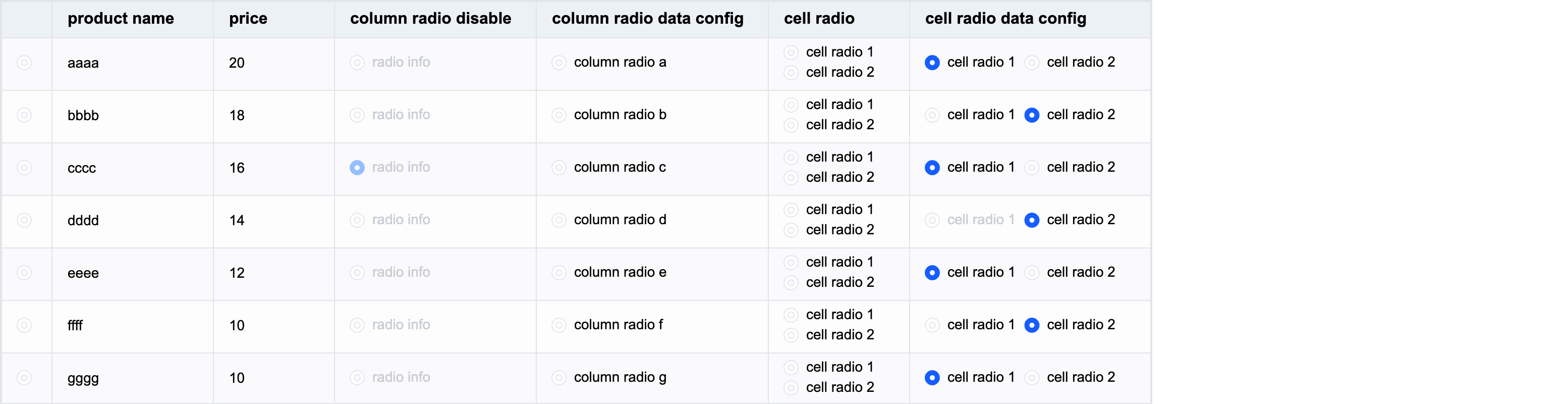!!!###!!!
radio button type
Radio button type cells are suitable for users to select one of multiple items in the table. Radio button type cells are widely used in many applications, including task management, data filtering, permission settings, etc.
The advantages of radio button cells in tables are as follows:
The use of radio button type cells is very intuitive and flexible. Users can select an option in a column or cell to perform specific actions or filter data according to their needs. This interaction method enables users to control their operations more finely, improving user experience and efficiency.
Radio button type cells usually use different icons or colors to indicate selected and unselected states, providing visual feedback. This way the user can easily identify which options have been selected and which have not.
Introduction to the exclusive configuration items of radio radio button
The unique configuration items of the radio radio button type in the configuration are as follows:
checked: Whether the cell is selected. The default value is false. Configuration functions are supported. Different cell configurations are different.
disable: Whether the cell radio button can be click-disabled. The default value is false. It supports configuration functions and has different configurations for different cells.
radioCheckType: The only range of the radio button, the default value is column:
column: The radio button is the only one selected in a column
cell: The radio button is uniquely selected in a cell
radioDirectionInCell: When there are multiple radio button boxes in a radio button type cell, the direction in which the radio button boxes are arranged. The default value is vertical:
vertical: The radio buttons are arranged vertically
horizontal: horizontal arrangement of radio buttons
Example:
{
headerType: 'radio', //Specify the header cell to be displayed as a radio buttoncellType: 'radio',//Specify the body cell to be displayed as a radio buttonfield: 'check',
checked: (args) => { if (args.row === 3) returntrue },
disabled: false,
radioCheckType: 'column',
radioDirectionInCell: 'vertical',
}
Introduction to the exclusive data type of radio radio button
The data corresponding to radio supports booleanstringObject, or an array composed of stringObject. In this case, multiple radio button boxes will be displayed in the cell; if the value is not set, the default is false.
Among the three types, it is more common to set the boolean type. For example, the check field is set as follows:
const columns=[
   {
     headerType: 'radio', //Specify the header cell to be displayed as a radio button
     cellType: 'radio',//Specify the body cell to be displayed as a radio button
     field: 'check',
   }
]
const records = [
   {
     product: 'a',
     check: true
   },
   {
      product: 'b',
     check: false
   },
   {
      product: 'c',
     check: false
   }
]
If set to string type, the text will be displayed on the right side of the radio box, and the radio button will be unselected by default. For example, the product field is set as follows:
const columns=[
   {
     headerType: 'radio', //Specify the header cell to be displayed as a radio button
     cellType: 'radio',//Specify the body cell to be displayed as a radio button
     field: 'product',
   }
]
const records = [
   {
     product: 'a',
   },
   {
      product: 'b',
   },
   {
      product: 'c',
   }
]
If each state of the data item is different, you can set the Object object.
The Object object supports configuring the following properties:
text: The text displayed in the radio button of this cell
checked: Whether the cell radio button is selected
disable: Whether the cell radio button is disabled
checked and disable support configuration in both data and column. The priority of configuration in data is higher than the configuration in column.
Get the data selection status through the interface
Get the selected status of all radio data under a certain field:
Note: The order corresponds to the original incoming data records and does not correspond to the status value of the row displayed in the table.
getRadioState(field?: string | number): number | Record<number, boolean | number>
Get the radio status of a certain cell:
Note: If a cell contains multiple radio button boxes, the return value is number, which refers to the index of the selected radio in the cell, otherwise the return value is boolean.
getCellRadioState(col: number, row: number): boolean | number
Through the above introduction, you have learned how to use the radio radio button type to display data in the VTable table. I hope it will be helpful to you.

