It is not only a fully functional graph visualization library, but also an explorer of data relationships.
!!!###!!!title=Raw Plugins——VisActor/VGraph tutorial documents!!!###!!!!!!###!!!description=Analysis components can help users better understand data and discover data features. vGraph extracts some common native data components from business scenarios and will continue to supplement its analysis capabilities.!!!###!!!
Native Components
Analysis components can help users better understand data and discover data features. vGraph extracts some common native data components from business scenarios and will continue to supplement its analysis capabilities.
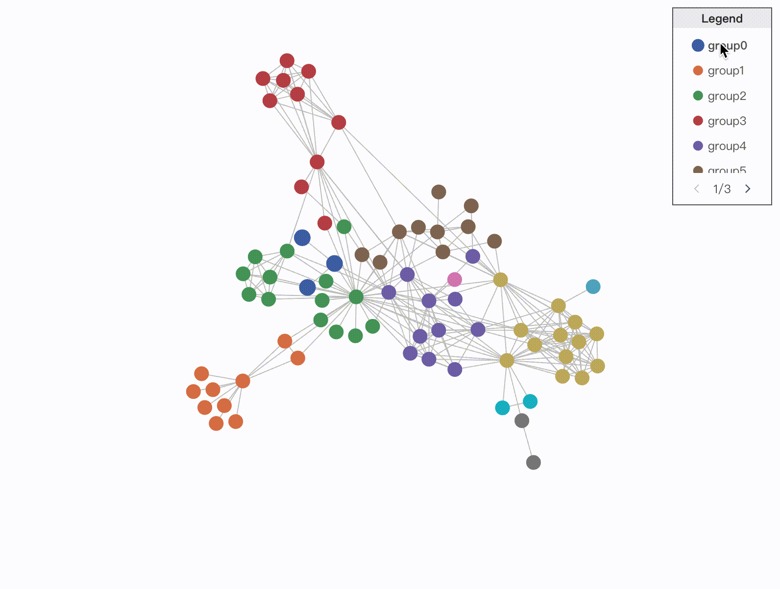
Legend
The Legend is a common supporting component in visualizations, used to explain the various symbols and colors used in the graph to help users understand. According to the mapped data features, legends are divided into categorical legends and continuous legends.
Categorical Legend
Categorical legends are used to distinguish the symbols or names of different data objects, and are usually used to represent categorical data.
The style of the paginator. When the spacing between legend items is smaller than the default spacing, pagination is automatically generated.
hover
{ enable?: boolean; // Enable hover interaction legendActiveState?: string; // Legend focus element state filter?: boolean; // Whether to enable main graph filtering graphActiveState?: string; // Main graph focus element state graphBlurState?: string; // Main graph non-focus element state };
The hover interaction is enabled through the enable property. In the default state, when a legend item is activated, the graphic elements of the selected legend item are enlarged and the text is displayed in bold. This can be customized by configuring the hover state style in setLegendStateStyles. When hovering over a legend item, the active state will be added to the corresponding main graph entity, which can be canceled or customized by configuring graphActiveState.
click
{ enable?: boolean; // Enable click interaction multiple?: boolean; // Allow multiple selections legendActiveState?: string; // Legend focus element state filter?: boolean; // Whether to enable main graph filtering graphActiveState?: string; // Main graph focus element state graphBlurState?: string; // Main graph non-focus element state };
The click interaction is enabled through the enable property. In the default state, when a legend item is enabled, the selected legend element is grayed out; the nodes corresponding to the selected legend element in the main graph are hidden.
setLegendStateStyles
(state: string, markerData: any) => { [key:string]:any //Set graphic style textStyles?: {[key:string]:any} //Set text style; //Set text style }
Used in conjunction with legendActiveState in hover and click to set the style of legend items in a specific state.
CategoryLegendDataItem
Configuration Item
Type
Description
marker
{ type?: 'rect' | 'circle' | 'icon' | 'image' | 'line' | 'quadratic' | 'cubic'; // The shape of the legend item's graphic [key: string]: any; // The style of the legend item's graphic }
The shape and style configuration of the graphic in the legend item.
label
string | { text: string; // Text [key: string]: any; // Text style }
The text of the legend item.
value
any
The specific value of the data dimension represented by the legend item.
Continuous Legend
Continuous legends represent a data range and are typically used for mapping numerical data dimensions.
The Legend is loaded into the graph container by default, but you can also specify a mount container.
padding
number | number[]
The padding at the edge of the legend.
encodeAttr
string
[Required] The data dimension encoded by the legend.
target
'node' | 'edge' | 'group'
[Required] The category of the main graph element encoded by the legend, which is divided into three categories: node, edge, and group.
channel
string
The graphic attribute to which the data dimension is mapped, such as fillStyle, lineWidth, etc.
color
{ max: number; min: number; }
The maximum and minimum values of the color to be used when using color mapping.
size
{ max: number; min: number; }
The maximum and minimum values of the size to be used when using size mapping.
value
{ max: number; min: number; }
The maximum and minimum values to be used for the data dimension when performing continuous mapping. When not defined, the maximum and minimum values of the encoded data dimension encodeAttr are automatically obtained.
label
{ max: number; min: number; }
The maximum and minimum text for continuous mapping. When not defined, the value is used as the legend text by default.
The mapping function for continuous mapping. The default is linear mapping. When the mapping function is pow, the default value is 2; when the mapping function is log, the default value is 10.
title
LegendTitleConfigs
The title of the legend. See the LegendTitleConfigs definition below for details.
orient
'vertical' | 'horizontal'
The layout of the legend, which supports both vertical and horizontal layouts. The default is a horizontal layout.
{ enable?: boolean; // Enable sliding interaction filter?: boolean; //Whether to perform main graph filtering graphActiveState?: string; // Main graph focus element state graphBlurState?: string; // Main graph non-focus element state }
The sliding interaction is enabled through the enable property. In the default state, when performing a sliding filter interaction, elements in the main graph that are not in the selected range will be hidden.
LegendTitleConfigs
Configuration Item
Type
Description
text
string | { text: string; // Text [key: string]: any; // Text style }
[Required] The content of the tooltip, which supports string and HTML.
trigger
'hover' | 'click'
The trigger method for the tooltip. The default is hover.
offset
number[]
The offset of the tooltip relative to the node's position.
className
string
Adds a class name to the tooltip container.
styles
object
Adds CSS styles to the tooltip.
target
'node' | 'edge' | 'group'
The element that triggers the tooltip. Single selection. The default is 'node'.
triggerId
string
A local graphic responds to the tooltip. Only graphics containing the triggerId will trigger the tooltip. The Tooltip will be positioned based on this graphic. If triggerId is configured, hovering over other parts of the node/edge will not trigger the tooltip.
showDelay
number
The delay in milliseconds for the tooltip to appear when the trigger is hover.
hideDelay
number
The delay in milliseconds for the tooltip to disappear when the trigger is hover.
The following is an example of how to use node label in conjunction with triggerId. When hovering over the node label, the corresponding tooltip will be displayed.
import { Graph, RawTooltip} from'@visactor/vgraph';
const graph = new Graph({
container: 'graphContainer',
setDefaultNode(node) {
return {
type: 'category',
radius: 2,
width: 80,
height: 20,
label: {
text: node.name,
// Specify triggerId, Tooltip will match and position based on this fieldtriggerId: 'triggerLabel',
},
};
},
...,
});
const tooltip = new RawTooltip(graph, {
styles: {
border: '1px solid #ccc',
padding: '8px',
borderRadius: '4px',
backgroundColor: '#fff',
},
content(entity: any, type: string) {
return`${entity.get('name')}: ${entity.get('id')}`;
},
target: 'node',
// Tooltip trigger methodtrigger: 'hover',
// Corresponds to the triggerId configured in the labeltriggerId: 'triggerLabel'});
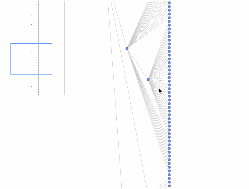
Minimap
The Minimap can assist users in getting a global overview and quickly locating items.
The Minimap is loaded into the graph container by default, but you can also specify a mount container.
className
string
Specifies the CSS class name for the Minimap viewport.
viewportStyles
object
Sets the CSS styles for the Minimap viewport.
type
'delegate' | 'keyShape'
For performance reasons, the minimap will not display all the details within a node. You can choose to use a specified graphic to represent the node, or you can directly specify the keyShape of the element.
showEdges
boolean
Whether to display edges in the Minimap. The default is false.
getNodeStyles
(node: Node) => Records<string, any>
The drawing style of the nodes in the Minimap. For properties, refer to Rectangle Configuration.
getEdgeStyles
(edge:Edge) => Records<string, any>
The drawing style of the edges in the Minimap. For properties, refer to Edge Configuration.
getGroupStyles
(group: Group) => Records<string, any>
The drawing style of the groups in the Minimap. For properties, refer to Rectangle Configuration.
enable
boolean
Whether to enable the minimap.
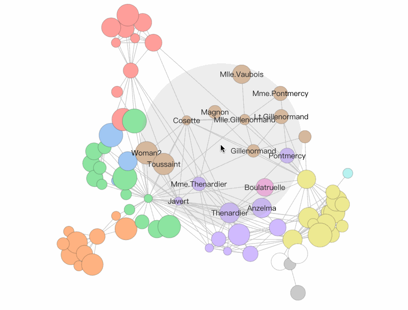
Fisheye Magnifier (FisheyePlugin)
FisheyePlugin is a fisheye magnifier component. In scenarios with a large amount of data and high data density, it can assist users in viewing information in the graph. You can also experience it in the fisheye magnifier demo.
import { Graph, FisheyePlugin} from'@visactor/vgraph';
const graph = new Graph(...options);
const fisheyePlugin = new FisheyePlugin(graph, ...options );
Configuration Item
Type
Description
bkgShape
boolean | Shape | {}
An auxiliary background graphic to display the inEyeR range. By default, a Circle with fillStyle: '#AAA', opacity: 0.2 is displayed. Setting it to false, null, or undefined will not display it. You can also pass a custom Shape or pass configuration items to configure a custom Circle.
showLabel
'node' | 'edge' | 'both' | 'none'
The method for displaying labels within the inEyeR range. node only displays node labels, edge only displays the labels of the edges connected to the nodes within the range. both displays both. none displays neither.
coordinateSystem
'graph' | 'canvas'
The coordinate system on which the fisheye effect acts. This mainly affects the behavior during scaling. If it is graph, the range of the fisheye on the graph remains unchanged during scaling. If it is canvas, the size of the fisheye on the canvas remains unchanged.
isSetState
boolean
Whether to perform a setState operation on the nodes. If true, it will setState to 'inEye' or 'outEye'.
A normal force-directed layout cannot prevent different groups from overlapping. vGraph has developed a grouping layout component, ForceDirectedGrouping, suitable for force-directed layouts. This component avoids overlap between groups by using a non-overlapping force between them. The component also encapsulates the display and interaction of group nodes. The ForceDirectedGrouping component is generally used in conjunction with a force-directed layout. You can also experience it in the force-directed node grouping layout demo.
import { Graph, ForceDirectedGrouping, ForceDirectedLayout} from'@visactor/vgraph';
const graph = new Graph(...options);
const forceGrouping = new ForceDirectedGrouping({graph, options:{...}} );
const fdp = new ForceDirectedLayout(forces:{
'someforce' : new ForceXXX({
...,
iterationCallback: forceGrouping.groupVelocity,
}), // Generally placed on the iterationCallback of ForceCollision, but if not, it can be placed on another Force.},...);
Configuration Item
Type
Description
graph
Graph instance
[Required] The graph data to be processed by the component.
options
options.getGroupValue
(nodeData)=>value: string | number | undefined
[Optional] A property or method to identify different groups of nodes. By default, it is the 'group' property in the nodes. If the value is undefined, it is a free node. The return value value must be of type string, number, or undefined.
options.shapeStyles
(groupValue)=>shapeConfigs
Configures the shape style of the groupShape. For details, see the configuration items for Circle. The currently supported GroupShape is Circle.
options.extraPadding
number
Configures the extra padding radius between Groups. The default is 10.
options.shapeDraggable
boolean
Configures whether to enable the drag interaction of the GroupShape. The default is true.
Instance Method
Return Value
Description
groupVelocity
void
Calculates the displacement required for the Group node to move. It is generally called through the iteration Callback of the collision force. Note: groupingVelocity has iteration and thresholdIteration variables. iteration will be incremented each time it is called, and it will only take effect when iteration > thresholdIteration. There are two purposes for this: 1. to reduce the amount of calculation; 2. to avoid destroying the initial global structure in the initial stage. thresholdIteration defaults to 200.
groupVelocity.reset(threshold?:number)
void
Resets iteration to 0 and sets thresholdIteration to threshold (if any).
groupVelocity.setThreshold(threshold:number)
void
Sets thresholdIteration to threshold.
updateData(graph:Graph)
void
Updates the component data.
getGroups()
{ key: node[] }
Gets all Groups. key is the groupValue.
getGroup( filter:(groupValue)=>boolean)
{ key: node[] }
Returns the Groups that meet the condition. key is the groupValue.
updateShapes()
void
Updates the state of the GroupShapes.
getAllGroupShapes()
{ key : Shape[] }
Returns all GroupShape entities. key is the groupValue.
getGroupShape( filter: (groupValue)=>boolean)
{ key : Shape[] }
Returns the GroupShape entities that meet the condition. key is the groupValue.
hideShape( filter: (groupValue)=>boolean)
void
Hides the GroupShape entities that meet the condition (will not affect the Group).
showShape( filter: (groupValue)=>boolean)
void
Shows the GroupShape entities that meet the condition.
setGetGroupValue( (nodeData)=>value)
void
Modifies the property or method for identifying different groups of nodes. This will trigger changes in the group and GroupShape.
setOptions(options: { ... });
void
Modifies the options. Modifying getGroupValue will trigger changes in the group and GroupShape.
on('groupshape:${event}',(ev)=>{})
void
Subscribes to interaction response events. event can be any meta-interaction response event, such as mouseup, mouseenter, touchstart, etc. It can also be encapsulated drag-and-drop related interactions such as ondrag, ondrop, ondragstart, ondragleave, ondragover, etc. ev.target is the interacted Shape, and the shape has an additional groupValue property. You can get it through shape.get('groupValue').
