It is not only a fully functional graph visualization library, but also an explorer of data relationships.
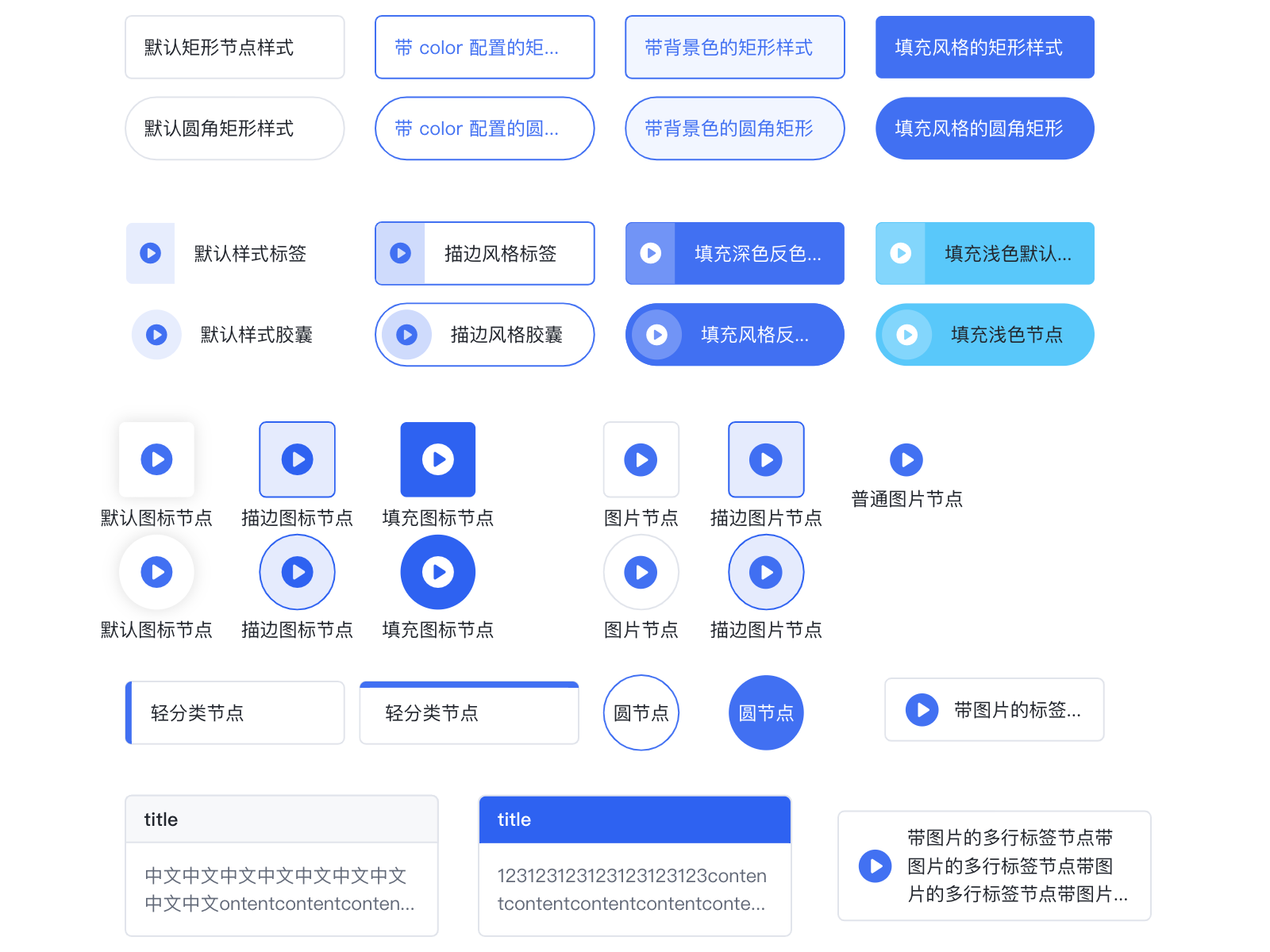
!!!###!!!title=Prebuilt——VisActor/VGraph tutorial documents!!!###!!!!!!###!!!description=There are several types of built-in nodes (rect, circle, image, tittle, category, tag, capsule, icon, imageTag). All built-in nodes support basic graphic drawing, anchors, icons, and label text labels. See [Built-in Nodes](/vgraph/demo/nodes/defaultNode).<img src="/vgraph/guide/node/inset_nodes.png" width="800">!!!###!!!
Built-in Nodes
There are several types of built-in nodes (rect, circle, image, tittle, category, tag, capsule, icon, imageTag). All built-in nodes support basic graphic drawing, anchors, icons, and label text labels. See Built-in Nodes.
Built-in Node Types
rect
Field
Type
Description
radius
number | number[]
The radius of the rounded corners. If it is a number, all four corners will have the same radius.
circle
Field
Type
Description
r
number
The radius of the circle. This will override width.
width
number
Specifies the radius of the circle. r = width/2.
rhombus
A rhombus node.
Field
Type
Description
radius
number | number[]
The radius of the rounded corners. If it is a number, all four corners will have the same radius.
image
The KeyShape of an image is generally a rectangle, but when the corner radius of the rectangle exceeds half of its width and height, the KeyShape is set to a circle. An image node consists of a background rectangle, an image, and a text label. At this time, configuring the strokeStyle and fillStyle fields will take effect on the background rectangle, forming the outer border and background color of the image node. If not configured, the background will be transparent. The default structure of an image is the image on top and the text at the bottom. On the basis of a common node, the image node supports configuring the image item:
Field
Type
Description
url
string
[Required] The image link.
width
number
The width of the image. By default, it is the width of the node.
height
number
The height of the image. By default, it is the height of the node. If a text label needs to be displayed, the node height needs to be increased, and the image height needs to be set to make space for the text label. For example, for the node in the figure above, the configuration is as follows:
{
id:'image',
type:'image',
x:310,
y:100,
width:115,
// Total node height height:50,
image: {
width:115,
// Image height, the remaining height is allocated to the label height:28,
url:'imageUrl',
},
label:'image',
}
title
This type extends rect with a title text and a title background. The content text corresponds to the label configuration and will be arranged adaptively according to the remaining height of the node, supporting multiple lines and overflow ellipsis. The title only supports single-line text and supports overflow ellipsis. The title field configuration is as follows:
Field
Type
Description
text
string
The title text.
height
number
The height of the title.
borderColor
string
The border color of the title background.
backgroundColor
string
The fill color of the title background.
fillStyle
string
The text color.
fontSize
number
The font size.
fontWeight
number
The font weight.
The full configuration of the title text can be seen in Text Graphic Configuration. The definition of the title node in the figure above is:
{
id:'nodeId',
type:'title',
x:120,
y:200,
width:100,
height:60,
// Title definition title: {
text:'title',
fillStyle:'#666',
backgroundColor:'#ccc',
},
// Content is defined as a common Label configuration label:'This is a title type node default style',
}
category
A category is a rectangular node with a category color block. At this time, the color configuration is the color of the category color block, and strokeStyle is the border color of the node. The definition of the category node in the figure above is:
A tag is a rounded rectangle node with an icon, label, or title. The color configuration is the theme color, and the theme can be outlined, filled, or lighted, with lighted being the default. It is generally not recommended to use both an icon and a title at the same time.
Field
Type
Description
color
string
The theme color, which will automatically calculate the actual color of each part based on the selected theme.
theme
'outlined' | 'filled'
The theme.
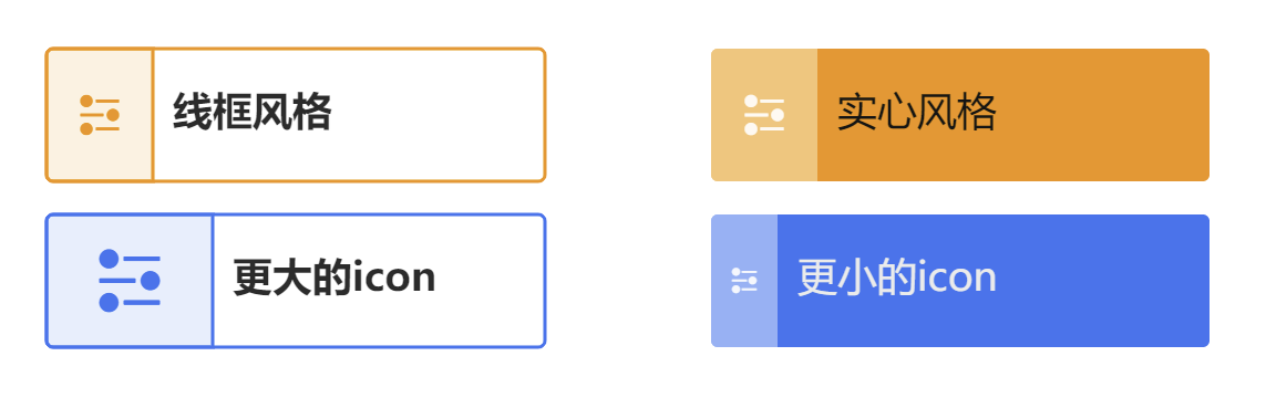
icon?
String | object
The icon. You can use iconfont directly, or define it using an object. size indicates the icon size, and background can define the background width and color of the icon part.
label
String | object
Defines the label.
title?
String | object
If a title is defined, the title will be the title, and the label will be the descriptive information.
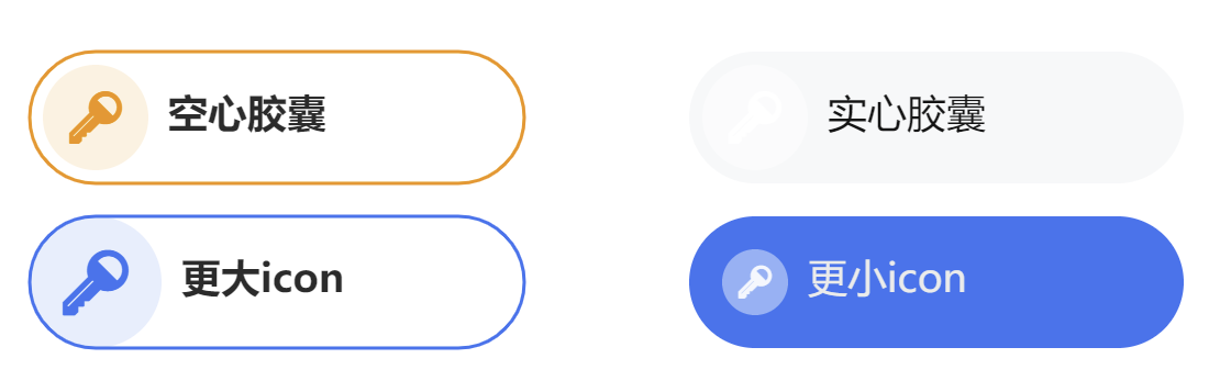
A capsule is a capsule-shaped node with an icon, title, or label. The color configuration is the theme color, and the configuration items are similar to tag, but icon.background.width is replaced with icon.background.radius to represent the radius of the icon's background circle.
The theme color, which will automatically calculate the actual color of each part based on the selected theme.
theme
'outlined' | 'filled'
The theme.
icon
string | object
The icon.
size
number
The icon size.
label
string | object
Defines the label.
imageTag
A node with an image and a text label side by side, supporting multi-line text with vertical centering.
Field
Type
Description
image
string | object
The node image. When the type is a string, it will draw an image with the URL as the image using the default configuration. You can also pass an object for further customization.
image.size
number
The image size. Currently, only square images with equal length and width are supported.
image.url
string
The image link.
label
string | object
Defines the text label.
Common Configuration Items
Field
Type
Description
id
string
[Required] The unique identifier for the node. Edges refer to the node's identifier.
Node type. vGraph has 8 built-in node types. Users can also extend and reference these node types. The default value is 'rect'. For details, see Built-in Nodes.
x
number
The horizontal coordinate of the node's center.
y
number
The vertical coordinate of the node's center.
width
number
The width of the node.
height
number
The height of the node.
groupId
string
The ID of the group to which the node belongs.
color
string
The color of the node, which varies depending on the node type.
label
string | LabelConfigs
The label text configuration. If it is a string, it will be placed in the default position according to the node type. For custom configuration, please see LabelConfigs below.
icons
IconConfigs[]
Sets the array of icons on the node. For details, see IconConfigs below.
anchors
number[][] | AnchorConfigs[]
Sets the anchors on the node. For details, see AnchorConfigs below.
Clipping shape. Sets the specified shape as the clipping path. The part within the clipping shape's path will be retained, and the rest will be culled. Refer to CanvasRenderingContext2D.clip().
cursor
string
The type of cursor when this shape gains focus. For details, refer to CSS Cursor.
