Custom nodes are one of the biggest pain points in the development of graph visualization applications. vGraph has summarized common custom node components in business and abstracted them into configurable tool methods to help everyone solve some visual effects that are not easy to implement.
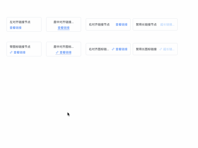
Displaying links on nodes for data detail jumps is a common requirement. vGraph encapsulates the visual and interactive aspects of links, allowing you to get an experience close to a native UI with simple configuration. You can refer to the example of a node with a link.
import { LinkUtils } from'@visactor/vgraph';
// container is the label container, which is generally the Layer parameter passed in by the node's custom methodconst container = new Layer({...});
// Generate the linkconst linkLayer = LinkUtils.init(container, linkOption);
Field
Type
Description
x
number
[Required] The horizontal coordinate of the link text. The behavior varies depending on the align property.
align
'left' | 'center' | 'right'
The alignment of the link.
y
number
[Required] The vertical coordinate of the center of the link text.
text
string
[Required] The link text.
onClick
(e: LayerEvent) => void;
[Required] The click event for the link.
disabled
boolean
Whether it is in a disabled style.
maxWidth
number
The maximum length of the link.
defaultColor
string
The color of the link in its default state.
hoverColor
string
The color of the link when hovered over.
activeColor
string
The color of the link when clicked.
disabledColor
string
The color of the disabled link.
triggerId
string
Can be used with native and React components' Tooltip to trigger hints.
