It is not only a fully functional graph visualization library, but also an explorer of data relationships.
!!!###!!!title=Behaviors——VisActor/VGraph tutorial documents!!!###!!!!!!###!!!description=vGraph has carefully polished and accumulated some high-frequency interactions in graph analysis scenarios, which can be referenced and registered to the graph instance as needed. The general usage is as follows:!!!###!!!
Behaviors
vGraph has carefully polished and accumulated some high-frequency interactions in graph analysis scenarios, which can be referenced and registered to the graph instance as needed. The general usage is as follows:
panZoom Pan and Zoom
panZoom adapts to the pan and zoom operations of both touchpads and mice. Two-finger panning on a touchpad pans the canvas, while two-finger pinching zooms the canvas. The mouse wheel scrolls to zoom the canvas. This is the most commonly used interactive behavior in graph analysis. Each time a pan or zoom operation is triggered, a transformed event is triggered on the graph instance. You can use the graph.on('transformed', e => {...}) event to update the zoom ratio of the zoom UI with the graph.getZoomRatio() method.
import { panZoom } from'@visactor/vgraph';
// Add pan and zoom interactiongraph.addBehavior(panZoom, { ...options });
// Remove interactiongraph.removeBehavior(panZoom);
Configuration Item
Type
Description
sensitivity
number
Zoom sensitivity, default is 2. The larger the value, the larger the zoom ratio.
keyShapeOnly
boolean
Whether to only display key shapes during pan and zoom. It is recommended to enable this when the data volume is large.
showKeyShapeDelay
number
The delay (ms) for displaying all shapes after pan and zoom.
xOnly
boolean
Only enable horizontal panning.
yOnly
boolean
Only enable vertical panning.
limit
boolean
Only allow panning in the area with shapes.
padding
number
Used with limit, allows for a margin in the panning range.
zoom
boolean
Whether to allow zooming, default is true.
autoPreventDefault
boolean
Whether to automatically prevent the browser's default behavior, such as left swipe to go back. Default is true. Can be used with shouldTrigger.
Whether to allow the current zoom and pan operation.
dragCanvas Drag Canvas
Drag the blank area of the canvas with the mouse to pan the canvas. It is generally used together with panZoom as a supplementary interaction for mouse panning.
Default canvasOnly:true, this interaction is only triggered when dragging the blank canvas. Set to false to respond to global dragging. Do not set to false if there are other drag operations on nodes or edges.
limit
boolean
Only allow panning in the area with shapes.
padding
number
Used with limit, allows for a margin in the panning range.
dragNode Drag Node
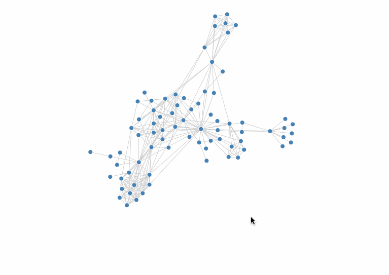
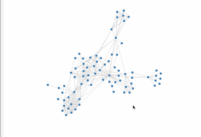
Dragging nodes is also a common interaction in graph analysis, often used to allow users to reorganize the structure of the graph.
Default delegate:true, a new shape is created for dragging, and the original layout is not changed during the drag process. When false, the node itself is dragged directly. The image below shows the effect of delegate: true.
Specify the style of the created shape, effective for delegate:true configuration.
shouldTrigger
(e: GraphEvent, shape: Shape) => boolean
Whether to allow dragging the node.
shouldDrop
(e: GraphEvent) => boolean
Whether to allow dropping the node.
autoTranslate
boolean
Whether to automatically scroll the canvas when the mouse is dragged to the edge of the viewport.
onDragStart
(node: Node, e: GraphEvent) => void
The event for when a node starts to be dragged.
onDrag
(node: Node, x: number, y: number) => void
The event for when a node's drag position is updated.
onDrop
(node: Node) => void
The event for when a node is dropped.
onDragEnter
(node: Node, x: number, y: number) => void
Triggered when the mouse drag point enters the node's range.
onDragLeave
(node: Node) => void
Triggered when the mouse drag point leaves the node's range.
xOnly
boolean
Only enable horizontal dragging.
yOnly
boolean
Only enable vertical dragging.
highlightRelations Highlight Relations
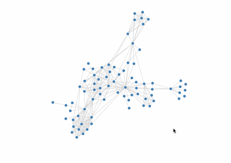
Hover/click on a node to highlight its direct neighbors. This, combined with the state of the entities in the graph, can help to view the connections between nodes.
When the zoom ratio of the graph is too small, it is generally believed that users are more concerned with the overall distribution of the data rather than the details of individual nodes. This interaction can highlight the information on the overall structure while hiding the details of the nodes. Combined with the state of the entities in the graph, it can highlight some key information when zooming out.
Configuration Item
Type
Description
hideRatio
number
The percentage of the current graph zoomed to the original graph that will trigger hiding, default is 0.2.
hideState
string
The state to add to the node when its details are hidden.
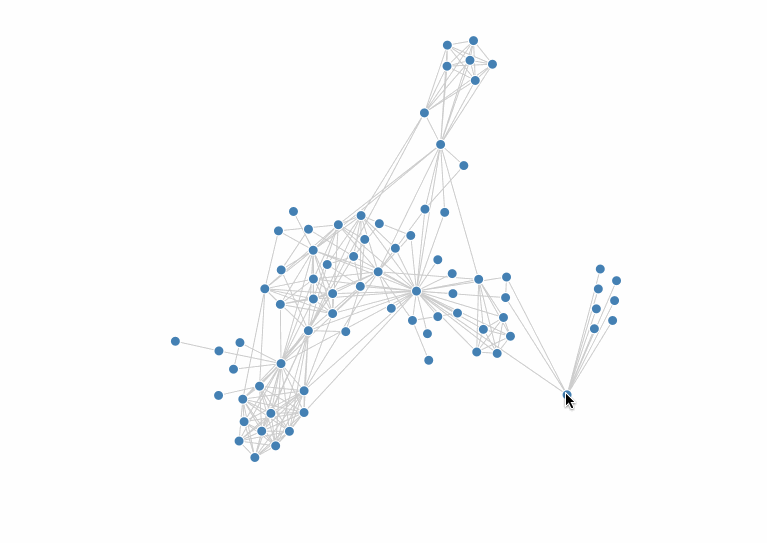
The following is a simple example of using hideDetails in conjunction with node states to get an overview of the overall structure while still being able to see the grouping of each node when the graph is zoomed out.
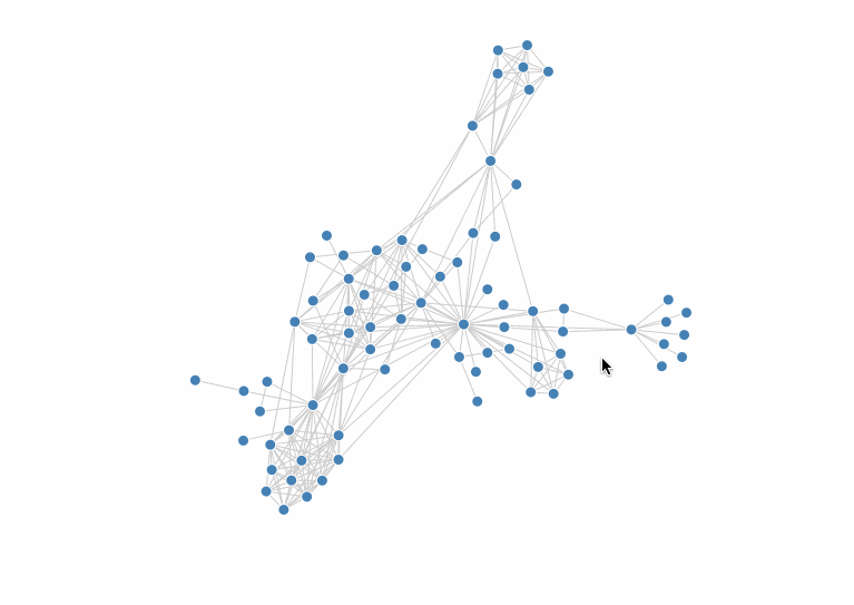
When there are many nodes in the graph, it is often the case that the text labels of the nodes overlap and are difficult to see. showDetails is used to solve this problem. When using this interaction, it is assumed that the user is viewing the overall structure of the graph in the default state, and the details of the nodes, etc., are displayed when zooming in.
Configuration Item
Type
Description
showRatio
number
The percentage of the current graph zoomed in to the original graph that will trigger showing details, default is 1.5.
targets
string[]
Which entities' labels to display. Default is [ node ].
showNodeState
string
The state to add to the node when its details are shown.
showEdgeState
string
The state to add to the edge when its details are shown, you need to configure 'edge' in targets.
attachableDragNode Attachable Drag Node
Dragging tree nodes is a common method of data reorganization in tree graph applications. vGraph has built-in attachable drag interaction, which organizes data in a WYSIWYG manner and can significantly improve user experience. For an application, please refer to Reorganize Tree Nodes.
When delegate is true, a new shape is created for dragging, and the original layout is not changed during the drag process. When false, the node itself is dragged directly.
Triggered when the node can be effectively attached.
onAttachNode
(parent: Node) => Node
Whether to allow attaching to the specified node.
findClosestNode
(target: Node) => boolean
Calculate the position of the attachable node based on the position of the dragged node. The default is to find the node with the smallest distance. For an application, please refer to Reorganize Tree Nodes.
brushSelect Brush Select
Brush select is a convenient component for batch data selection. vGraph has built-in brush select interaction, which can be used for batch selection of nodes, edges, and groups. For an application, please refer to Brush Select Demo.
The objects that can be selected. Can be one or more, optional values are 'node', 'edge', 'group'.
bkgStyles
Record<string, any>
The style of the selection box, see rect configuration for details, note to configure opacity.
autoTranslate
boolean
Whether to automatically scroll the canvas when the mouse is selected to the edge of the viewport, default is true.
canvasOnly
boolean
Whether to start brush selection only when selecting on the blank canvas, default is true. It is recommended to enable this when there is also a dragNode interaction in the graph.
shouldTrigger
(e: GraphEvent) => boolean
Whether to allow starting brush selection.
onSelect
(entity: Node | Edge | Group) => boolean
The event for selecting an object during dragging. When false is returned, the node will not be selected.
onDeSelect
(entity: Node | Edge | Group) => void
The event for deselecting an object during dragging.
onChange
(entity: (Node | Edge | Group)[]) => void
The event for when the brush selection is completed.
multipleSelect Multiple Select
Multiple select is a general data selection component that allows users to select/deselect elements in the graph by holding down a modifier key, achieving more precise and flexible data selection than brush select.
