It is not only a fully functional graph visualization library, but also an explorer of data relationships.
!!!###!!!title=Options——VisActor/VGraph tutorial documents!!!###!!!!!!###!!!description=Nodes are composed of several parts:<img src="/vgraph/guide/node/NodeOverall.png" width = "80%" />The graphic part can be configured through configuration items before building. The graphic part of a node includes the key shape, other shapes, and anchors.vGraph has 8 built-in common nodes. Different built-in nodes define different KeyShapes and other Shapes. For details, please see the [Built-in Nodes](/vgraph/guide/node-spec/prebuilt) section. Text labels, icons, and anchors are common configuration items for all built-in nodes, and are all empty by default. Titles and images can only be configured for specific built-in nodes.> Node state and relationships are properties that a node has after it is built and can be operated on through instance methods.> KeyShape and States are defined as follows:>> - KeyShape: Can be considered the skeletal structure of the node, used to define the main scope of the node, including as a basis for event capturing, connection, etc. For details on usage, see the [KeyShape](/vgraph/guide/keyshape) section.> - States: Node state can be considered a convenient method for when the node structure remains unchanged but its appearance changes. For details on usage, see the [State Management](/vgraph/guide/states) section.!!!###!!!
Nodes
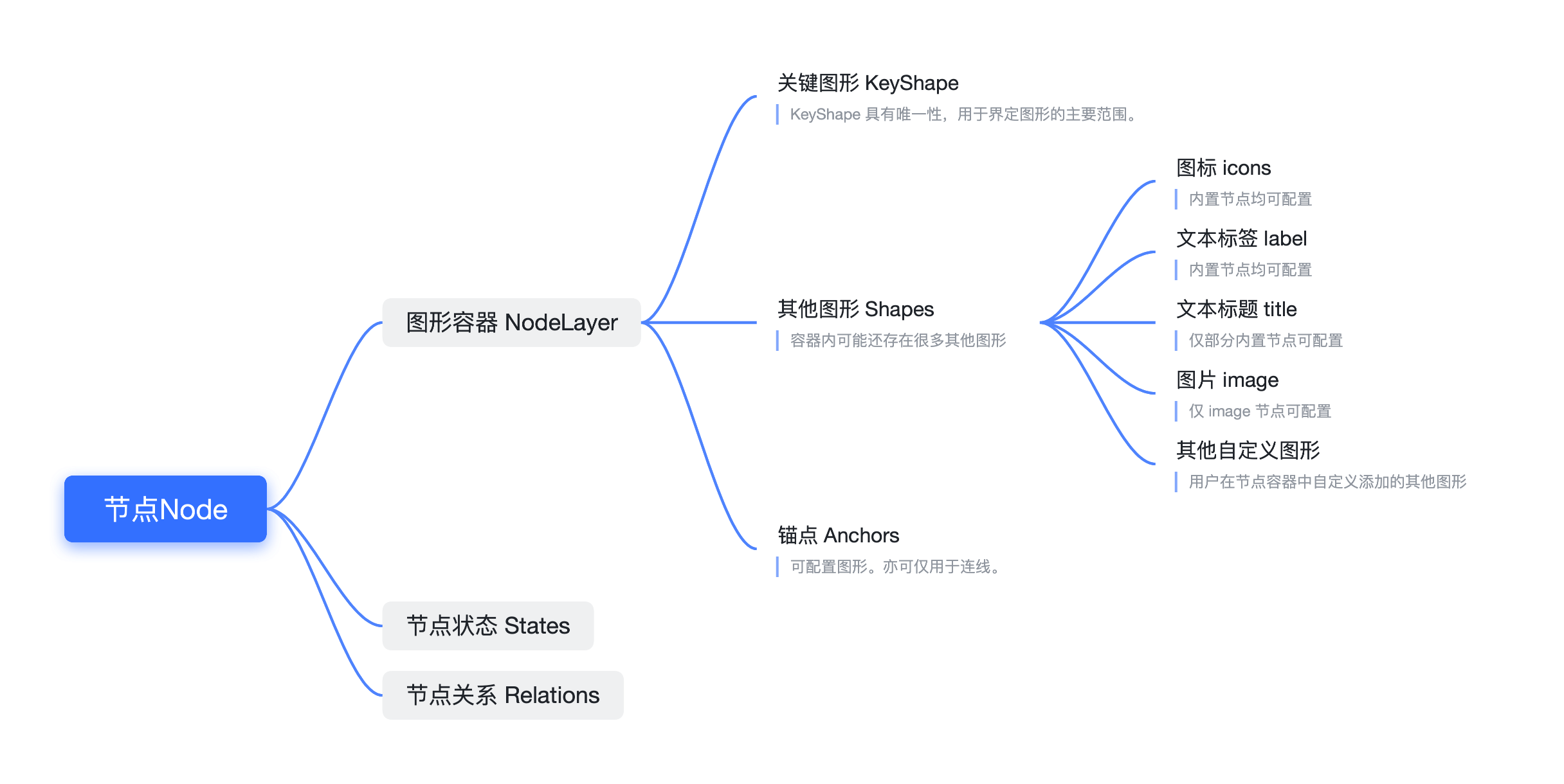
Nodes are composed of several parts:
The graphic part can be configured through configuration items before building. The graphic part of a node includes the key shape, other shapes, and anchors.
vGraph has 8 built-in common nodes. Different built-in nodes define different KeyShapes and other Shapes. For details, please see the Built-in Nodes section. Text labels, icons, and anchors are common configuration items for all built-in nodes, and are all empty by default. Titles and images can only be configured for specific built-in nodes.
Node state and relationships are properties that a node has after it is built and can be operated on through instance methods.
KeyShape and States are defined as follows:
KeyShape: Can be considered the skeletal structure of the node, used to define the main scope of the node, including as a basis for event capturing, connection, etc. For details on usage, see the KeyShape section.
States: Node state can be considered a convenient method for when the node structure remains unchanged but its appearance changes. For details on usage, see the State Management section.
Node type. vGraph has 8 built-in node types. Users can also extend and reference these node types. The default value is 'rect'. For details, see Built-in Nodes.
x
number
The horizontal coordinate of the node's center.
y
number
The vertical coordinate of the node's center.
width
number
[Required] The width of the node.
height
number
[Required] The height of the node.
groupId
string
The ID of the group to which the node belongs.
color
string
The color of the node, which varies depending on the node type.
label
string | LabelConfigs
The label text configuration. If it is a string, it will be placed in the default position according to the node type. For custom configuration, please see LabelConfigs below.
icons
IconConfigs[]
Sets the array of icons on the node. For details, see IconConfigs below.
disableIcons
boolean
When disableIcons is true, the icon will not appear on hover.
anchors
number[][] | AnchorConfigs[]
Sets the anchors on the node. For details, see AnchorConfigs below.
disableAnchors
boolean
When disableAnchors is true, the anchor will not appear on hover.
Nodes all have a unique KeyShape, and therefore also inherit the common configuration items of the KeyShape. Note: The properties of the KeyShape configuration items and the common configuration items are at the same level. The usage priority of KeyShape configuration is higher than that of node configuration items (e.g., color configuration). The following are the common configuration items for graphic objects:
Field
Type
Description
opacity
number
Opacity
fillStyle
string
Fill color
cursor
string
The style to display when the mouse pointer hovers over the element. Refer to CSS.cursor.
Clipping shape. Sets the specified shape as the clipping path. The part within the clipping shape's path will be retained, and the rest will be culled. Refer to CanvasRenderingContext2D.clip().
cursor
string
The type of cursor when this shape gains focus. For details, refer to CSS Cursor.
Note: Color strings currently support the following formats: rgb, rgba, hsl, hsla, hex (3, 6, 8-digit hexadecimal), name, linear gradient, radial gradient, and picture, etc.
Label
Built-in nodes can all be configured with a Label. Different nodes may have different default configurations.
Field
Type
Description
text
string
[Required] The content of the text label.
width
number
Limits the maximum width of the text.
height
number
Limits the maximum height of the text.
fontSize
number
The font size of the text. The default is 12.
lineHeight
number
The line height.
fontWeight:
'normal' | 'bold' | 'bolder' | 'lighter' | number
The font weight.
textOverflow
'clip' | 'ellipsis'
The text overflow handling. 'clip' truncates the text, while 'ellipsis' uses an ellipsis.
In business scenarios, a large number of node icons are used to assist users in understanding and provide concise interaction methods. vgraph can accept icon font files such as iconfont and Font Awesome and apply them to nodes.
The icons configuration should be an array of IconConfigs.
IconConfigs
Field
Type
Description
setStyles
(configs) => IconStyle
[Required] The style settings for the icon. The parameter is the configuration information of the node. Since there is often a need to change the icon and style based on node data, the callback function mode can perform more efficient updates.
setBgStyles
(configs) => IconBgStyle
The background style settings for the icon. The parameter is the configuration information of the node. Considering that the icon may be difficult to see due to the background color, you can add a circular or rectangular background to the icon.
position
number []
[Required] Determines the position of the icon with the top-left corner of the node as [0, 0] and the bottom-right corner as [1, 1]. This ensures that the icon is displayed as expected when the node is scaled, etc.
offset
number[]
The horizontal and vertical pixel offset. It can be offset inside or outside the node.
show
'always' | 'hover'
The display method of the icon. The default is always visible. It can also be set to display when the mouse hovers over the node.
onClick
(e, nodeData) => void;
The callback for the icon click event.
IconStyles
The configurable styles for an icon are as follows:
Field
Type
Description
icon
string
The icon reference code, similar to .
fillStyle
string
The fill color of the icon.
size
number
The size of the icon. Currently, only icons with the same width and height are supported.
fontFamily
string
The font file needs to be imported first and a name defined. In the following example, it should be 'iconfont'.
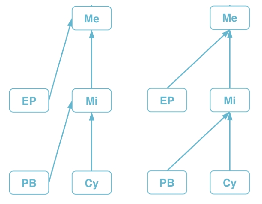
Anchors are used to specify the connection points for nodes and edges. If no anchors are specified, the edge will calculate the shortest connection between the two nodes. The anchor position can be a two-dimensional array, where each array consists of two numbers, defining the anchor's position in the form of [0, 0] for the top-left corner and [1, 1] for the bottom-right corner of the node. The anchor's position should be a value between 0 and 1, defined as follows:
The effects of defining four anchors and two anchors are as follows.
If you don't need to display the anchor graphic, you can simply configure the position array. vGraph also provides an array of configuration items. If you need to display the anchor graphic on the node, please use this method to configure it. The AnchorConfigs configuration items are defined as follows:
AnchorConfigs
Field
Type
Description
type
string
Anchor type. The default is 'dot'.
position
number[]
An array of length 2, used to specify the relative position of the anchor. [0, 0] is the top-left corner, and [1, 1] is the bottom-right corner.
offsets
number[]
An array of length 2, used to specify the absolute pixel offset of the anchor's position.
linkOffsets
number[]
An array of length 2, used to specify the absolute pixel offset of the connection point between the edge and the anchor.
show
'always' | 'hover'
The display method of the anchor graphic. The default is always visible. It can also be set to display when the mouse hovers over the node.
size
number
The diameter of the custom anchor. Currently, only anchors with the same width and height are supported.
setStyles
(nodeData) => AnchorStyles
Anchor style settings. fillStyle: string configures the fill color, and strokeStyle: string configures the line color.
onClick
(event, nodeData) => void
The event triggered when the anchor is clicked.
onMouseEnter
(event, nodeData) => void
The event triggered when the mouse moves over the anchor.
onMouseLeave
(event, nodeData) => void
The event triggered when the mouse moves away from the anchor.
The above configuration defines two anchors on the left and right sides of the node. The left anchor will only be displayed when the node gains mouse focus, while the right anchor has a mouse click event defined.
