It is not only a fully functional graph visualization library, but also an explorer of data relationships.
!!!###!!!title=Options——VisActor/VGraph tutorial documents!!!###!!!!!!###!!!description=Grouping is used to represent nodes with the same logic or to organize a series of nodes for batch operations. Groups can be nested, and you can specify how nodes inside and outside the group are connected to meet the display needs of different scenarios. Currently, vGraph supports rectangular groups.> Group state and relationships are properties that a group has after it is created and can be operated on through instance methods.> KeyShape and States are defined as follows:>> - KeyShape: Can be considered the skeletal structure of the group, used to define the main scope of the group container, including as a basis for event capturing, connection, etc. For details on usage, see the [KeyShape](/vgraph/guide/keyshape) section.> - States: Group state can be considered a convenient method for when the group structure remains unchanged but its appearance changes. For details on usage, see the [State Management](/vgraph/guide/states) section.!!!###!!!
Grouping
Grouping is used to represent nodes with the same logic or to organize a series of nodes for batch operations. Groups can be nested, and you can specify how nodes inside and outside the group are connected to meet the display needs of different scenarios. Currently, vGraph supports rectangular groups.
Group state and relationships are properties that a group has after it is created and can be operated on through instance methods.
KeyShape and States are defined as follows:
KeyShape: Can be considered the skeletal structure of the group, used to define the main scope of the group container, including as a basis for event capturing, connection, etc. For details on usage, see the KeyShape section.
States: Group state can be considered a convenient method for when the group structure remains unchanged but its appearance changes. For details on usage, see the State Management section.
Group Configuration
Field
Type
Description
id
string
Unique identifier for the group.
groupId
string
Groups can be nested. Specifies the parent group ID.
padding
number | number[]
Groups will wrap all nodes by default. You can specify padding for the area. You can specify padding in the order of top, right, bottom, left.
linkNode
boolean
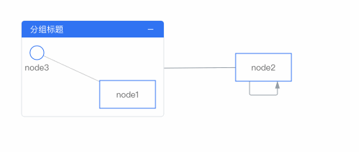
Whether to connect lines directly to the internal nodes of the group. Default is false.
linkGroupOnCollapse
boolean
When linkNode: true is configured, collapsing the group will collapse all lines of the nodes within the group by default. Configuring linkGroupOnCollapse allows the lines to temporarily connect to the group when it is collapsed. See Group Collapse Proxy Lines for an example.
titleSize
number
[NEW] Group title size. Depending on the titlePosition configuration, this will correspond to the width or height of the title.
titlePosition
'left' | 'top'
Group title position. Default is top, above the group.
title
{// Title text, for more configurations, please see Graphic Objects - Text text: { text: string; ...textConfigs, }, // Title background, optional background?: { height?: number; fillStyle?: string; strokeStyle?: string; }, // Right-side icon, optional icon?: { icon: string; fillStyle?: string; size?: number; onClick?: (e: any) => void; }
vgraph supports setting a text title for a group and configuring its background.
anchors
number[][] | AnchorConfigs[]
Configure anchors. If only a position array is passed, the anchor graphic will not be displayed. Using an Object type configuration will draw the anchor graphic. For details, see Anchor Configuration.
Customize the group title drawing method. Draws based on (0, 0) as the base point, and by default fills the width of the group, with the height being the configured titleSize.
fixLeft
number
Fixes the left edge of the group.
fixTop
number
Fixes the top edge of the group.
fixWidth
number
Fixes the width of the group.
fixHeight
number
Fixes the height of the group.
Groups all have a unique KeyShape, and therefore also inherit the common configuration items of the KeyShape. Note: The properties of the KeyShape configuration items and the common configuration items are at the same level. The usage priority of KeyShape configuration is higher than that of node configuration items (e.g., color configuration). The following are the common configuration items for graphic objects:
Field
Type
Description
opacity
number
Opacity
fillStyle
string
Fill color
cursor
string
The style to display when the mouse pointer hovers over the element. Refer to CSS.cursor.
Clipping shape. Sets the specified shape as the clipping path. The part within the clipping shape's path will be retained, and the rest will be culled. Refer to CanvasRenderingContext2D.clip().
cursor
string
The type of cursor when this shape gains focus. For details, refer to CSS Cursor.
Note: Color strings currently support the following formats: rgb, rgba, hsl, hsla, hex (3, 6, 8-digit hexadecimal), name, linear gradient, radial gradient, and picture, etc.
Group Title
vGraph has summarized common grouping scenarios in business and provides detailed configurations to meet most needs. The title text is required, while other components are optional. The following is an example of a complete group configuration:
If your group title is more complex, Group supports configuring renderGroupTitle to customize the title content. The input parameter width is the current maximum width of the title, which allows the title to adapt when the group box model changes. It needs to return the title height to correctly calculate the group's positioning. The following is a simple implementation of a centered title.
const groupData = {
renderGroupTitle(group: Group, layer: Layer, width: number) {
const text = new Text({
// Center the titlex: width / 2,
y: 12,
text: 'Group Title',
fontSize: 14,
textAlign: 'center',
textBaseline: 'middle',
});
layer.add(text);
// Return the title heightreturn24;
},
strokeStyle: '#E1E4E8',
radius: 4,
}
Group Anchors
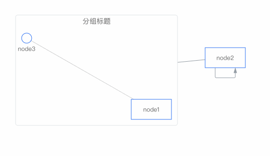
Anchors are used to specify the connection points for groups and lines. If you want lines to connect directly to the nodes, you can set the group configuration item linkNode: true. If no anchors are specified, the connection point with the shortest line will be calculated as the anchor. The anchor position can be a two-dimensional array, where each array consists of two numbers, defining the anchor's position in the form of [0, 0] for the top-left corner and [1, 1] for the bottom-right corner of the node. The anchor's position should be a value between 0 and 1.
If you don't need to display the anchor graphic, you can simply configure the position array. vGraph also provides an array of configuration items. If you need to display the anchor graphic on the group, please use this method to configure it. The AnchorConfigs configuration items are defined as follows:
Field
Type
Description
type
string
Anchor type. Default is 'dot'.
position
number[]
An array of length 2, used to specify the relative position of the anchor. [0, 0] is the top-left corner, and [1, 1] is the bottom-right corner.
offsets
number[]
An array of length 2, used to specify the absolute pixel offset of the anchor's position.
linkOffsets
number[]
An array of length 2, used to specify the absolute pixel offset of the connection point between the line and the anchor.
show
'always' | 'hover'
The display method of the anchor graphic. The default is always visible. It can also be set to display when the mouse hovers over the node.
size
number
Configures the diameter of the anchor. Currently, only anchors with the same width and height are supported.
setStyles
(nodeData) => AnchorStyles
Anchor style settings. fillStyle: string configures the fill color, and strokeStyle: string configures the line color.
onClick
(event, nodeData) => void
The event triggered when the anchor is clicked.
onMouseEnter
(event, nodeData) => void
The event triggered when the mouse moves over the anchor.
onMouseLeave
(event, nodeData) => void
The event triggered when the mouse moves away from the anchor.
