VSeed, an elegant data composer, transforming complexity into simplicity.
!!!###!!!title=VChart Layout Basic Concepts——VisActor/VChart Contributing Documents!!!###!!!!!!###!!!description=---title: 9.1 Basic Concepts of VChart Layout key words: VisActor,VChart,VTable,VStrory,VMind,VGrammar,VRender,Visualization,Chart,Data,Table,Graph,Gis,LLM---VChart, as a powerful chart library, also has strong layout capabilities, with built-in compact layout mode, grid layout, and support for custom layout capabilities. !!!###!!!
VChart, as a powerful chart library, also has strong layout capabilities, with built-in compact layout mode, grid layout, and support for custom layout capabilities.
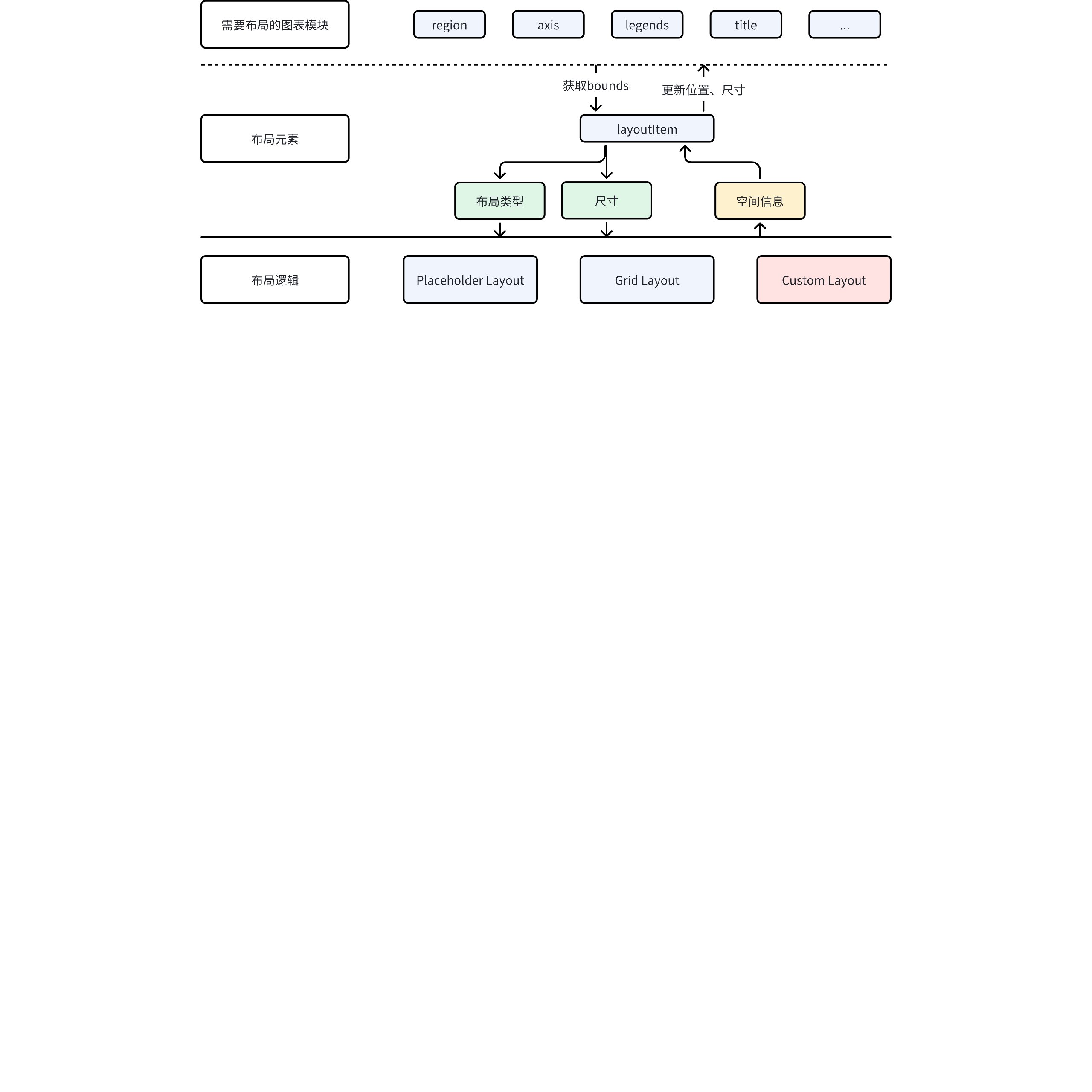
Layout Elements
In VChart, not all chart components participate in the layout, such as tooltip and crosshairs, which do not participate in the layout. Currently, the parts that participate in the layout in VChart are: title, legend, axes, region, datazoom, scrollBar.
However, the layout logic in VChart is not implemented according to module types. VChart has a comprehensive extension mechanism, so there may be a variety of extended components, and these components may also need to participate in the layout. Therefore, the concept of layout elements was used in the design of layout capabilities.
Basic Concepts
Layout elements are not equivalent to chart modules; they are independent abstract elements used by the layout system. The chart layout module only lays out the layout elements, ignoring what the actual components of the chart are.
The chart module participates in the layout by holding a layout element and communicating with the layout element.
Layout Element Attributes
Layout elements have several important attributes:
Layout Type: Built-in placeholder layouts provide different layout logic to elements through the layout type.
Spatial information: Supports attributes such as x, y, lef, top, right, bottom, width, height, etc. However, in different layout logics, only some attributes will take effect. For example, in grid layout, the elements within the cell x, y will not be affected by the configured x, y.
Layout Logic
VChart has two built-in layout logics and supports custom layouts.
Placeholder Layout
This is the most commonly used layout logic. As shown in the figure below.
By placing elements into canvas placeholders one by one, a compact layout is eventually formed.
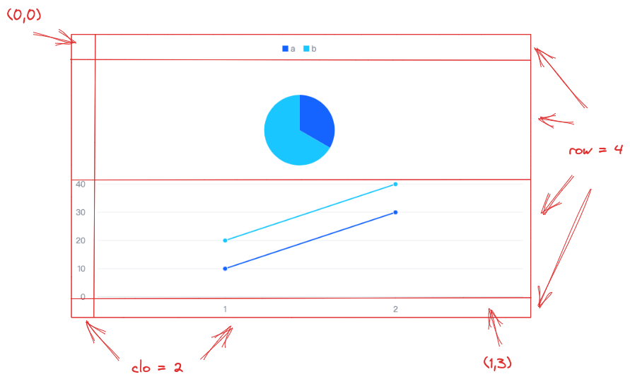
Grid Layout
Grid layout divides the canvas into a grid of n rows by m columns according to row and column information, and then places chart elements into the cells.
For example, the following example on the official website is a grid layout of 2 columns, 4 rows.
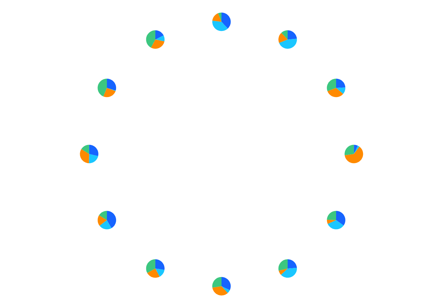
VChart also provides custom layout capabilities, allowing users to freely set spatial properties for all layout elements.
For example, this example on the official website.
Draw 12 pies at the twelve positions of the clock. No additional attribute configuration is needed for these pie charts, and the layout logic is only about 10 lines.
