A rose chart is a statistical chart drawn under the polar coordinate system, in which each category in the data is divided into equal parts, and the distance extending outward from the center of each part depends on the value it represents. The rose chart is suitable for displaying cyclical data (months, seasons, etc.) and has been used by British statistician Florence Nightingale to display the number of soldiers who died during the Crimean War.
In VChart, the difference between a rose chart and a pie chart is that a pie chart uses the angle range of the sector to represent the difference in values while the radius of the sector remains consistent, while a rose chart uses the radius of the sector to represent the difference in values while the angle range of the sector remains consistent. It's the sectors with different radii that make up the beautifully staggered "rose petals".
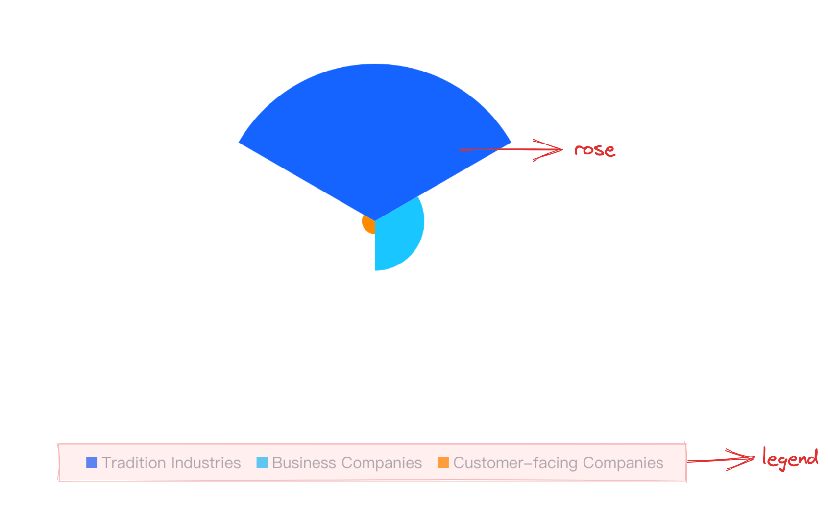
Chart Composition
The rose chart consists of sector elements and other components.
Sector elements are the basic elements of a rose chart, and related drawing configurations are essential:
roseChart.type: Chart type, pie/doughnut chart type is 'rose'
roseChart.data: Data source for chart drawing
roseChart.categoryField: Category field, mapping different sector elements
roseChart.valueField: Value field, mapping the radius of the element's sector
roseChart.seriesField: Category field, mapping the color of the element's sector
Axes, tooltips, and other components that assist in chart display are optional configurations with default effects and functionality:
roseChart.axes: Axes component, displayed by default and automatically infers the coordinate system and data mapping logic according to the chart type, for detailed configuration see VChart Axes Component Configuration
A grouped rose chart can be seen as a 'bent grouped bar chart', which arranges different categories of rose series in a spaced manner along the polar coordinate system, with each group of rose series representing a category.
In VChart, you need to append fields to categoryField (at this point, categoryField exists as an array), which are used to distinguish data categories, i.e., to split a single rose series dimensionally and expand it in a spaced manner. And to distinguish the spaced columns in the same dimension, you need to specify the roseChart.seriedField field, which by default maps the sector color.
Stacked Rose Chart
A stacked rose chart can be seen as a 'bent stacked bar chart', which combines different categories of rose series in a stacked manner, with each group of rose series representing a category.
In VChart, if you want to display a stacked rose chart, you need to configure roseChart.stack: true, and to distinguish the stacked sectors within the same dimension, you need to specify the roseChart.seriedField field, which by default maps the sector color.
Auxiliary components for chart display, such as tooltips, are optional configurations with default effects and functionality: