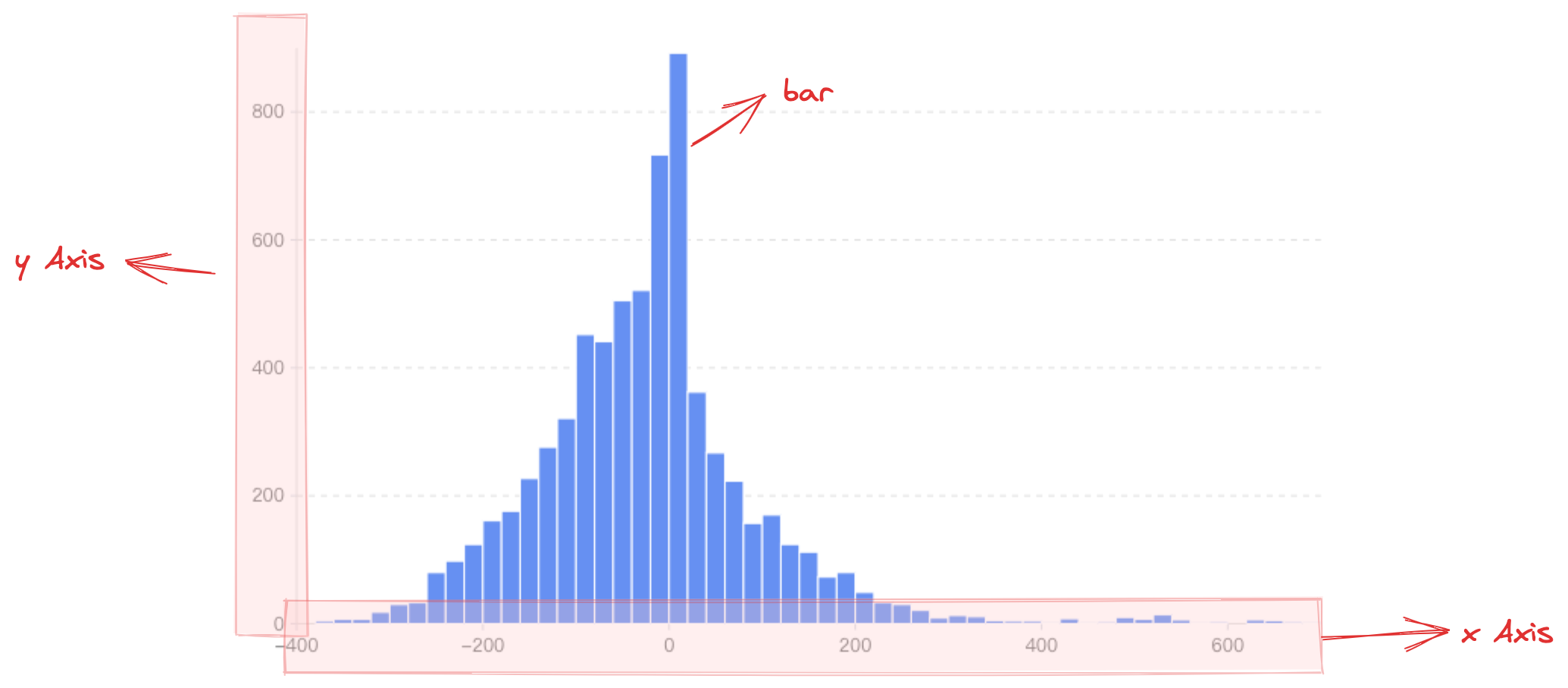
Histogram, also known as a quality distribution chart, is used to represent the distribution of data, and is a common statistical chart. The horizontal axis generally represents the data range, the vertical axis represents the distribution, and the higher the column, the larger the number of elements in that range.
Chart Structure
The histogram is composed of rectangular elements, coordinate axes, and other components.
The rectangle element is the basic element of the histogram, and the relevant drawing configuration is indispensable:
histogramChart.type: Chart type, the type of histogram is 'histogram'
histogramChart.data: Data source for chart drawing
histogramChart.xField: Numeric field, mapping the x-coordinate / width of the element
histogramChart.x1Field: Numeric field, mapping the x1-coordinate of the element
histogramChart.yField: Numeric field, mapping the y-coordinate / height of the element
histogramChart.y1Field: Numeric field, mapping the y1-coordinate of the element
Like other charts, the histogram supports the configuration of the direction attribute. When direction: 'horizontal', xField maps the width of the rectangle element, yField and y1Field map the upper and lower boundaries of the rectangle element. Coordinates, i.e., y and y1 coordinates; when direction: 'vertical', yField maps the height of the rectangle element, xField and x1Field map the left and right boundaries of the rectangle element. Coordinates, namely x and x1 coordinates.
Coordinate axes, tooltips, and other components that assist chart display are optional configuration, with default effects and functionality:
histogramChart.axes: Coordinate axis component, displayed by default, and automatically infers coordinate system and data mapping logic according to chart type. Note that histograms do not support discrete axes because they are used to statistically analyze the frequency distribution within each data range, and the main axis(values) must be entered as a value range, which isn't supported by the discrete axis. Detailed configuration can be found at VChart coordinate axis component configuration
Declare the xField property as the frequency statistics left range field
Declare the x2Field property as the frequency statistics right range field
Declare the yField property as the frequency value field
Histogram Features
Unlike bar charts, histograms display data within a specific segment, so the dimension axis usually requires two fields to represent the start and end points of the interval. Moreover, since the interval is a value range, the dimension axis is a continuous axis. The index axis uses a numeric field to represent column height.
Histograms and line charts are often used together to provide clearer and more accurate visualizations of data distribution characteristics. Compared to a single histogram, a histogram paired with a line chart not only intuitively displays data distribution in the chart, but also better emphasizes data trends and deviation changes.
Different Frequency Distribution Histogram
Since the left and right boundary positions of the columns are determined by different data fields, this means that the size of the data intervals determines the column width (or column height when direction: 'horizontal'). Different data intervals can be drawn to form histograms with different frequency distributions.
Generating Histogram Data Using the
Since version 2.0.7, histograms support the bin transform. When your data is in a detailed (raw) format, you can use this transform to generate standard histogram data.
The bin transform supports the following configuration options:
interface IBinOptions {
  /**
   * The numeric field to be binned
   */
  field: string;
  /**
   * Number of bins (default is 10)
   */
  bins?: number;
  /**
   * Explicitly specified array of bin boundaries
   */
  thresholds?: number[];
  /**
   * Fixed bin width (interval step); overrides bins if set
   */
  step?: number;
  /**
   * Specify the minimum and maximum values for binning [min, max]; otherwise, calculated automatically from the data
   */
  extent?: [number, number];
  /**
   * Whether to retain original data items in each bin
   */
  includeValues?: boolean;
  /**
   * Field name mapping for the output data
   */
  outputNames?: { x0?: string; x1?: string; count?: string; values?: string };
}
Chart Layout
Stacked Histogram
In VChart, to display a stacked histogram, set histogramChart.stack: true, and to distinguish columns stacked under the same dimension, specify histogramChart.seriedField. This field defaults to mapping the area color.