VSeed, an elegant data composer, transforming complexity into simplicity.
!!!###!!!title=PopTip Component——VisActor/VRender tutorial documents!!!###!!!!!!###!!!description=The PopTip component is a pop-up box component provided by VRender, similar to common PopTip components, used to display additional information during user interaction. The PopTip component supports multiple interaction methods, allows customization of styles and content, and supports various layout options.!!!###!!!
PopTip Component
The PopTip component is a pop-up box component provided by VRender, similar to common PopTip components, used to display additional information during user interaction. The PopTip component supports multiple interaction methods, allows customization of styles and content, and supports various layout options.
Introduction
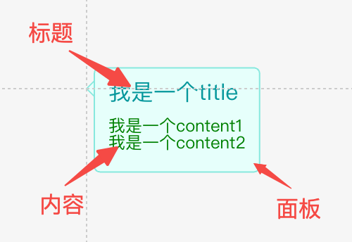
The PopTip component consists of the following parts:
title: The title of the PopTip component.
content: The content of the PopTip component.
panel: The panel of the PopTip component.
In terms of configuration, you can set the width and height of the PopTip, customize the title and content styles, and configure layout properties such as the spacing between the title and content (space), and padding.
The corresponding configuration interface is as follows:
type PopTipAttributes = {
/** Position, refer to arco design */
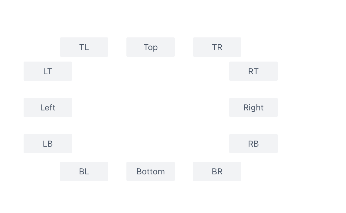
position?: 'auto' | 'top' | 'tl' | 'tr' | 'bottom' | 'bl' | 'br' | 'left' | 'lt' | 'lb' | 'right' | 'rt' | 'rb';
/**
* Title content, use an array if line breaks are needed, e.g., ['abc', '123']
*/
title?: string | string[] | number | number[];
/** Title style */
titleStyle?: Partial<ITextGraphicAttribute>;
titleFormatMethod?: (t: string | string[] | number | number[]) => string | string[] | number | number[];
/**
* Content text, use an array if line breaks are needed, e.g., ['abc', '123']
*/
content?: string | string[] | number | number[];
/** Content text style */
contentStyle?: Partial<ITextGraphicAttribute>;
// Content formatting function
contentFormatMethod?: (t: string | string[] | number | number[]) => string | string[] | number | number[];
/**
* Spacing between title and content
*/
space?: number;
/**
* Internal padding
*/
padding?: Padding;
/**
* Background panel configuration for the label, TODO: support symbol shape
*/
panel?: BackgroundAttributes & ISymbolGraphicAttribute & { space?: number };
/**
* Minimum width, in pixels
* @default 30
*/
minWidth?: number;
/**
* Maximum width, in pixels. When the text exceeds the maximum width, it will be automatically truncated.
*/
maxWidth?: number;
// Maximum width percentage
maxWidthPercent?: number;
visible?: boolean;
visibleFunc?: (graphic: IGraphic) => boolean;
state?: StateStyle;
dx?: number;
dy?: number;
} & Omit<IGroupGraphicAttribute, 'background'>
As shown in the image, PopTip supports multiple positioning options, which can be configured using the position property. Additionally, there is an auto positioning option that automatically adjusts the positioning based on the PopTip's location to avoid being obscured. The positions are attempted in the following order: ['top', 'tl', 'tr', 'bottom', 'bl', 'br', 'left', 'lt', 'lb', 'right', 'rt', 'rb'].
The PopTip will expand based on its content by default. You can set the minimum and maximum width using minWidth and maxWidth, respectively. If you are unsure about the specific pixel configurations, you can use maxWidthPercent to set a maximum width percentage based on the aspect ratio.
Usage
The PopTip can be used as a regular component and added to the scene tree using the xxx.add method, similar to other components.
Additionally, we provide a plugin (poptipForText) for usage. This plugin automatically identifies truncated text in the canvas. When the mouse hovers over the text, it will display a PopTip to show the complete content of the text.
You can configure the style of the PopTip displayed through the attribute.poptip property on the graphic element. The type of the attribute.poptip property is consistent with the parameters accepted by the PopTip component. The PopTip will automatically fill in the content to display the complete text.
By adding poptipForText to the pluginList property of the stage when creating it, you can enable this plugin.
In this usage scenario, it may be inconvenient to configure all styles in the attribute.poptip. Therefore, the PopTip plugin provides theme configuration. You can import setPoptipTheme from the @visactor/vrender-components package to configure the theme. The theme properties configuration is consistent with the PopTip component's attribute configuration interface. The plugin will prioritize the poptip property defined on the graphic element. If not defined, it will use the theme configuration, and finally the component's own configuration.
