VSeed, an elegant data composer, transforming complexity into simplicity.
!!!###!!!title=VRender Components Introduction——VisActor/VRender tutorial documents!!!###!!!!!!###!!!description=Components are special primitives and also special Groups. VRender provides a series of built-in components, such as `datazoom`, `axes`, `label`, `legend`, `poptip`, etc., which can help us quickly achieve some common interactive effects. Externally, custom components can be implemented by inheriting `AbstractComponent` from `@visactor/vrender-components`.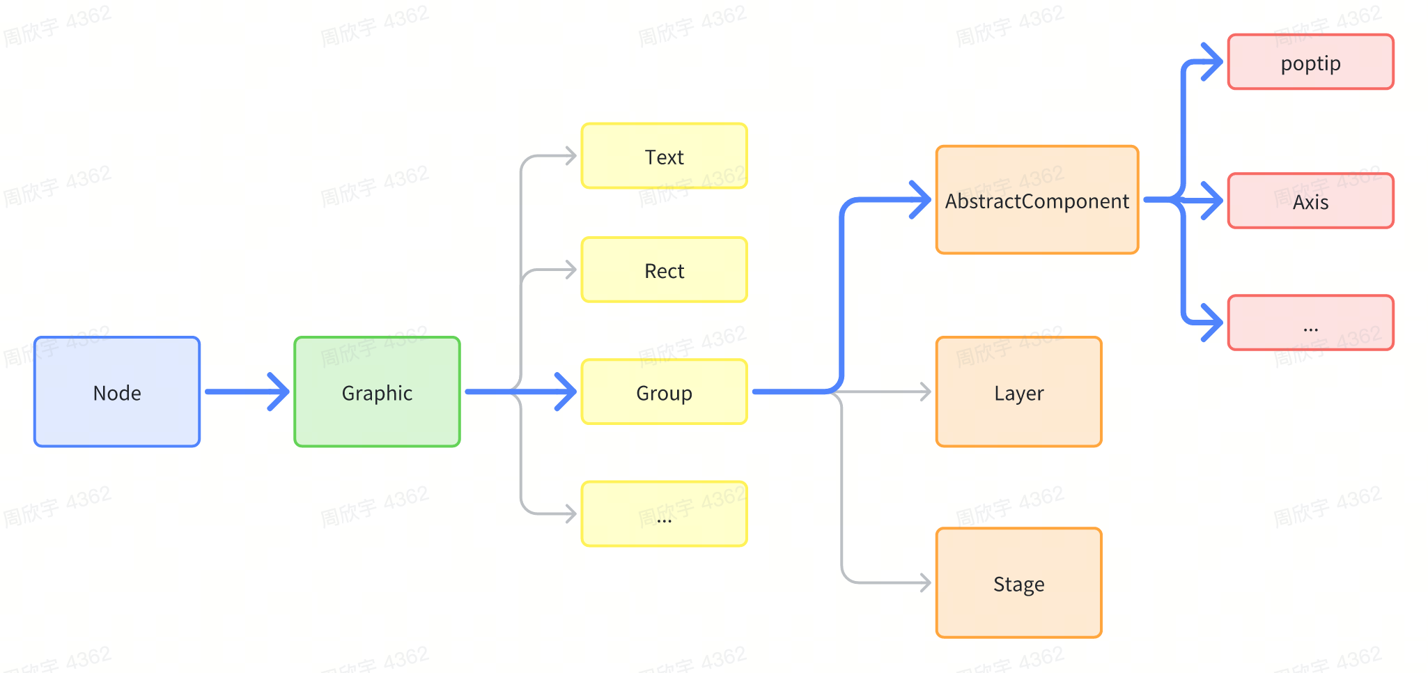!!!###!!!
Components
Components are special primitives and also special Groups. VRender provides a series of built-in components, such as datazoom, axes, label, legend, poptip, etc., which can help us quickly achieve some common interactive effects. Externally, custom components can be implemented by inheriting AbstractComponent from @visactor/vrender-components.
Introduction
Components are implemented based on the Group primitive, so the component itself is a special Group primitive. All configurations that can be supported by Group primitives can be configured to components, but of course, in general, components will abstract a set of special configurations for defining the special configurations of the component. Components internally contain other primitives and the logic of the component. For example, the axes component contains line primitives, text primitives, path primitives, etc. Different types of axes components have different styles, and the labels in the axes component implement anti-overlapping logic based on various strategies.
Using Components
Since components are implemented based on the Group primitive, when using them, simply use them as a Group, but this Group will internally manage its own child elements and have its own state.
Custom components are simpler than custom primitives, as they do not need to customize render and pick, because the primitives they use are already existing primitives. We only need to implement our own logic inside the component, similar to react.
Inherit AbstractComponent
Define your own attribute, because components often contain different child element modules, such as axis labels, axis ticks, axis lines, etc., so you can define an attribute interface to define the properties of the component.
Override the render function, which will be called every time valid attributes are updated. In the render function, create and manage child elements.
Here is a simple example. For example, if we want to implement a component that is a box containing circles, and when the number of circles is passed in, it can draw that number of circles:
import { AbstractComponent } from '@visactor/vrender-components';
classCircleBoxextendsAbstractComponent<Required<CircleBoxAttributes>> {
name = 'circleBox';
static defaultAttributes: Partial<CircleBoxAttributes> = {
circleStyle: {
fill: 'red',
},
circleCount: 10,
width: 300,
height: 300 };
constructor(attributes: PopTipAttributes, options?: ComponentOptions) {
super(options?.skipDefault ? attributes : merge({}, CircleBox.defaultAttributes, attributes));
}
// Called every time valid attributes are updatedprotectedrender(){
const { circleCount, circleStyle, width, height } = this.attribute;
const minWH = Math.min(width, height);
const count = Math.ceil(Math.sqrt(circleCount));
const radius = Math.floor(minWH) / count / 2;
for (let i = 0; i < circleCount; i++) {
// Calculate the position of the child elementconst x = (i % count) * radius * 2 + radius;
const y = Math.floor(i / count) * radius * 2 + radius;
// Add or create child elementsconst circle = this.createOrUpdateChild(`circle-${i}`, { ...circleStyle, radius, x, y }, 'circle');
}
}
}
After customizing, you can use it just like other components.

